Adaptive Trend (Expo)Adaptive Trend (Expo)
DESCRIPTION
This Adaptive Trend (Expo) indicator is used to detect trends as well as to adapt to the trend characteristic in order to filter-out trend noise. Having an indicator like this enables professional traders to stay longer in trends. The indicator is also equipped with upper- and lower boundaries as well as a mid-line.
Positive trend
If the two trendlines (positive & negative trendline) emerges into one single line, it’s regarded as a positive trend. If a green cloud is painted in the indicator it’s a sign that the indicator is categorizing that price move as noise, and thus the professional trader should keep their long position, or enter Long.
Negative trend
If the two trendlines (positive & negative trendline) separates and become two lines as well as a red cloud is painted in the indicator, this is regarded as a negative trend.
As a general rule, if the ‘positive & negative trendline’ is above the midline there is a positive trend. If the ‘positive & negative trendline’ is below the midline there is a negative trend.
You have the possibility to change the ‘trendvalue’, a shorter length is more sensitive than a longer length.
HOW TO USE
1. Use the indicator to identify trends.
2. Use the indicator as a trend following strategy.
INDICATOR IN ACTION
EURUSD
EURUSD
EURUSD
BTCUSD
The indicator works with RENKO, HEIKIN ASHI and with KAGI charts as well.
I hope you find this indicator useful, and please comment or contact me if you like the script or have any questions/suggestions for future improvements. Thanks!
I will continue to work on this indicator, so please share your experience and feedback with me so that I can continuously improve it. Thanks to everyone that have contacted me regarding my scripts. Your feedback is valuable for future developments!
ACCESS THE INDICATOR
• Contact me on TradingView or use the links below
-----------------
Disclaimer
Copyright by Zeiierman.
The information contained in my scripts/indicators/ideas does not constitute financial advice or a solicitation to buy or sell any securities of any type. I will not accept liability for any loss or damage, including without limitation any loss of profit, which may arise directly or indirectly from use of or reliance on such information.
All investments involve risk, and the past performance of a security, industry, sector, market, financial product, trading strategy, or individual’s trading does not guarantee future results or returns. Investors are fully responsible for any investment decisions they make. Such decisions should be based solely on an evaluation of their financial circumstances, investment objectives, risk tolerance, and liquidity needs.
My scripts/indicators/ideas are only for educational purposes!
Cari dalam skrip untuk "the script"

Extremes (Expo) Extremes (Expo)
DESCRIPTION
This Extreme (Expo) indicator identifies areas where the market is extreme. The length of the extreme calculation can be changed and gives you the flexibility to choose how sensitive the indicator should be. A longer length means that the indicator only identifies bold extremes. A shorter length is more sensitive and thus identifies all extremes in the market.
When the market is in an extreme mode, keep your trade until the extreme mode ends.
Postive extreme is when the price is above the positive extreme lines. (Keep your long trade until the positive extreme ends).
Negative extreme is when the price is below the negative extreme lines. (Keep your short trade until the negative extreme ends).
The Extremes (Expo) can be used to visualize the trend. Price crossing indicates a directional change. Price can also bounce off the extremes lines, which can act as dynamic support and resistance. It is often used in combination with other signals and analysis techniques.
TREND
The indictor has a Trend- feature that can be switched on which identifies trend shifts as well as trend direction.
A positive trend is when all three trendlines are green, and when the price is at least above one of these three lines.
A Negative trend is when all three trendlines are red, and when the price is at least under one of these three lines.
When the color of the trend lines changes color it indicates that the trend might shift direction. When all three trendlines have shifted color a trend is established.
PULLBACK
A bonus feature that is added to the trend-setting is that it can detect pullbacks in trends. This is visualized by that one of the three trendlines change color. For instance, say that all 3 lines are red (negative trend) and one of these lines changes color to green it can be regarded as a pullback in the negative trend.
HOW TO USE
1. Use the indicator to identify extreme areas.
2. Use the indicator to identify trends.
3. Use the indicator to identify trend shifts.
4. Use the indicator to identify pullbacks in trends.
INDICATOR IN ACTION
EXTREMES
BTCUSD
BTCUSD
TESLA
WALL STREET
TREND & PULLBACK
WALL STREET
EURUSD
I hope you find this indicator useful , and please comment or contact me if you like the script or have any questions/suggestions for future improvements. Thanks!
I will continue to work on this indicator, so please share your experience and feedback with me so that I can continuously improve it. Thanks to everyone that have contacted me regarding my scripts. Your feedback is valuable for future developments!
ACCESS THE INDICATOR
• Contact me on TradingView or use the links below
-----------------
Disclaimer
Copyright by Zeiierman.
The information contained in my scripts/indicators/ideas does not constitute financial advice or a solicitation to buy or sell any securities of any type. I will not accept liability for any loss or damage, including without limitation any loss of profit, which may arise directly or indirectly from use of or reliance on such information.
All investments involve risk, and the past performance of a security, industry, sector, market, financial product, trading strategy, or individual’s trading does not guarantee future results or returns. Investors are fully responsible for any investment decisions they make. Such decisions should be based solely on an evaluation of their financial circumstances, investment objectives, risk tolerance, and liquidity needs.
My scripts/indicators/ideas are only for educational purposes!

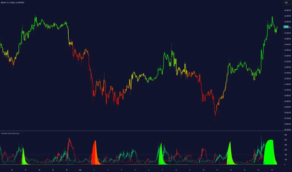
Volatility Index (Expo)Volatility Index (Expo)
DESCRIPTION
Volatility can be referred to many things, but a commonly accepted definition of volatility is that it’s a measure of the risk or uncertainty in the market. Higher volatility is equal to more risk in the market. A simple way of describing it is that when volatility is high, the value of the market can be spread out over a larger range of values. This means that the price of the market can change dramatically over a short time period in either direction. A lower volatility means that a market's value does not fluctuate dramatically, and tends to be steadier. However, how to calculate and to apply volatility has been widely debated and many different calculations have been used. Volatility Index is a must for a professional trader in today's volatile markets.
This Volatility Index is derived from research within Volatility.
HOW TO USE
1. Use the indicator to detect low- respectively high volatility.
2. Enter the market when the volatility is low, and exit the market when the volatility is high.
3. Use the indicator to identify when the volatility peaks. Can indicate that the market will shift or can be good areas to take profits.
Trend
When the market is in a positive trend, the volatility is low and stable. The opposite happens when the market is in a negative trend, the volatility is high and price moves boldly.
As a rule ,when volatility increases unusually(abnormal) in relation to previous periods something is happening in the market, then wait until the volatility peaks or when the indicator does not make any new highs (the indicator becomes flat), and in conjunction with that the trending price action doesn’t make any new lows or respectively highs. When this happens there is a high probability that the market will take a temporary turn.
Positive volatility refers to when the volatility index increases with green candlesticks this means that the buyers are more aggressive than sellers. (Can indicate a trend change)
Negative volatility refers to when the volatility index increases with red candlesticks this means that the sellers are more aggressive than buyers. (Can indicate a trend change)
INDICATOR IN ACTION
This indicator is best presented live, the graphs below gives a hint of how the Volatility Index works.
The indicator works on any market, security, currency, stock, etc. and on any timeframe.
BTCUSD
EURUSD
WALL STREET
I hope you find this indicator useful , and please comment or contact me if you like the script or have any questions/suggestions for future improvements. Thanks!
I will continue to work on this indicator, so please share your experience and feedback with me so that I can continuously improve it. Thanks to everyone that have contacted me regarding my scripts. Your feedback is valuable for future developments!
ACCESS THE INDICATOR
• Contact me on TradingView or use the links below
-----------------
Disclaimer
Copyright by Zeiierman.
The information contained in my scripts/indicators/ideas does not constitute financial advice or a solicitation to buy or sell any securities of any type. I will not accept liability for any loss or damage, including without limitation any loss of profit, which may arise directly or indirectly from use of or reliance on such information.
All investments involve risk, and the past performance of a security, industry, sector, market, financial product, trading strategy, or individual’s trading does not guarantee future results or returns. Investors are fully responsible for any investment decisions they make. Such decisions should be based solely on an evaluation of their financial circumstances, investment objectives, risk tolerance, and liquidity needs.
My scripts/indicators/ideas are only for educational purposes!
Intelligent Trend (Expo)Intelligent Trend - (Expo)
DESCRIPTION
The Intelligent Trend is a powerful trend visualizing tool with real-time decision points. The indicator analyzes the current trend and identifying areas where a new decision should be made. These points will appear in pullbacks or where the market will change. The trader should always make a new decision on these points.
You can switch on the "long-term Trend", which is an incredible good way to visualize the long-term trend. Otherwise, the recommended settings for the indicator is a length of 75- 200.
HOW TO USE
1. Use the indicator to visualize trends.
2. Use the indicator to identify real-time decision points in the market.
INDICATOR IN ACTION
APPLE
BTCUSD
BTCUSD
BRENT
AMZN
EURUSD
EURUSD
I hope you find this indicator useful, and please comment or contact me if you like the script or have any questions/suggestions for future improvements. Thanks!
I will continue to work on this indicator, so please share your experience and feedback with me so that I can continuously improve it. Thanks to everyone that have contacted me regarding my scripts. Your feedback is valuable for future developments!
ACCESS THE INDICATOR
• Contact me on TradingView or use the links below
-----------------
Disclaimer
Copyright by Zeiierman.
The information contained in my scripts/indicators/ideas does not constitute financial advice or a solicitation to buy or sell any securities of any type. I will not accept liability for any loss or damage, including without limitation any loss of profit, which may arise directly or indirectly from use of or reliance on such information.
All investments involve risk, and the past performance of a security, industry, sector, market, financial product, trading strategy, or individual’s trading does not guarantee future results or returns. Investors are fully responsible for any investment decisions they make. Such decisions should be based solely on an evaluation of their financial circumstances, investment objectives, risk tolerance, and liquidity needs.
My scripts/indicators/ideas are only for educational purposes!

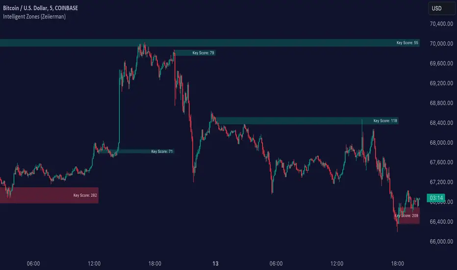
Intelligent Zones (Expo)Intelligent Zones - (Expo)
DESCRIPTION
Intelligent zones is a real-time based indicator that creates colored zones that can act as support or resistance levels. These zones that are painted on the graph are important levels that the future price will react too.
Generally, strategy:
--> If the price crosses up from the cloud it can be considered as a positive “breakout” and the price will most probably continue in that direction.
--> If the price crosses down from the cloud it can be considered as negative “breakout” and the price will most probably continue in that direction.
--> If the price is above the black line it can be considered as positive sentiment, and if the price is below the black line it can be considered as a negative sentiment.
--> The indicator comes in 2 versions. The main difference is how the intelligent cloud is calculated. Sensitive or not.
HOW TO USE
1. Use the indicator to identify real-time market zones.
2. Use the indicator to visualize breakouts.
INDICATOR IN ACTION
The indicator is best presented live, the graphs below are a good guide.
EURUSD
BTCUSD
BRENT
I hope you find this indicator useful , and please comment or contact me if you like the script or have any questions/suggestions for future improvements. Thanks!
I will continue to work on this indicator, so please share your experience and feedback with me so that I can continuously improve it. Thanks to everyone that have contacted me regarding my scripts. Your feedback is valuable for future developments!
ACCESS THE INDICATOR
• Contact me on TradingView or use the links below
-----------------
Disclaimer
Copyright by Zeiierman.
The information contained in my scripts/indicators/ideas does not constitute financial advice or a solicitation to buy or sell any securities of any type. I will not accept liability for any loss or damage, including without limitation any loss of profit, which may arise directly or indirectly from use of or reliance on such information.
All investments involve risk, and the past performance of a security, industry, sector, market, financial product, trading strategy, or individual’s trading does not guarantee future results or returns. Investors are fully responsible for any investment decisions they make. Such decisions should be based solely on an evaluation of their financial circumstances, investment objectives, risk tolerance, and liquidity needs.
My scripts/indicators/ideas are only for educational purposes!
High – Low Trend Indicator Signal (Expo)High - Low Trend Indicator Signal - (Expo)
DESCRIPTION
This indicator is derived from my previous one called High – Low Trend Indicator (Expo) , but the difference is that this one generates Long signals and detects market changes. These two indicators are intended to be used in the same chart for better accuracy and validation of signals. The indicator is perfectly used to identify pullbacks in positive trends!
HOW TO USE
When a signal appears, consider enter long, or look for confirmation patterns. Such confirmation could be seen in the High – Low Trend Indicator (Expo) when the red cloud disappears or when the black price line crosses out from the red cloud, or when the black price line crosses up over the blue midline.
So,
1. Use the indicator to identify Long signals.
2. Use the indicator to find Entry points in positive trends.
3. Use the indicator to detect market changes.
4. Combine it with High – Low Trend Indicator (Expo).
INDICATOR IN ACTION
The indicator is best presented live, the graphs below are a good guide.
EURUSD
DAX
WALL STREET
GOLD
I hope you find this indicator useful , and please comment or contact me if you like the script or have any questions/suggestions for future improvements. Thanks!
I will continue to work on this indicator, so please share your experience and feedback with me so that I can continuously improve it. Thanks to everyone that have contacted me regarding my scripts. Your feedback is valuable for future developments!
ACCESS THE INDICATOR
• Contact me on TradingView or use the links below
-----------------
Disclaimer
Copyright by Zeiierman.
The information contained in my scripts/indicators/ideas does not constitute financial advice or a solicitation to buy or sell any securities of any type. I will not accept liability for any loss or damage, including without limitation any loss of profit, which may arise directly or indirectly from use of or reliance on such information.
All investments involve risk, and the past performance of a security, industry, sector, market, financial product, trading strategy, or individual’s trading does not guarantee future results or returns. Investors are fully responsible for any investment decisions they make. Such decisions should be based solely on an evaluation of their financial circumstances, investment objectives, risk tolerance, and liquidity needs.
My scripts/indicators/ideas are only for educational purposes!
High - Low Trend Indicator - (Expo)High - Low Trend Indicator - (Expo)
DESCRIPTION
This trend indicator is derived from the highest (High) and lowest (Low). The unique formula enables clarity in trends and fast response to market changes.
Negative trend
The market could be considered to be in a negative trend when the black price line is under the blue Midline and a major red cloud is created. For some markets, the orange- trendline can be switched on to identify the long-term trend in the market. So, if the price line is under the orange trendline the market is in a negative trend.
Positive trend
The market could be considered to be in a positive trend when the black price line is above the blue Midline and close to the upper-line. For some markets, the orange-trendline can be switched on to identify the long-term trend in the market. So, if the price line is above the orange trendline the market is in a positive trend.
The indicator should be used in combination with High – Low Trend Indicator Signal (Expo) to identify market changes.
HOW TO USE
1. Use the indicator to identify trends.
2. Use the indicator to find Entry points in trends.
3. Combine it with High – Low Trend Indicator Signal (Expo).
INDICATOR IN ACTION
The indicator is best presented live, the graphs below are a good guide.
EURUSD
DAX
WALL STREET
EURJPY
GOLD
I hope you find this indicator useful , and please comment or contact me if you like the script or have any questions/suggestions for future improvements. Thanks!
I will continue to work on this indicator, so please share your experience and feedback with me so that I can continuously improve it. Thanks to everyone that have contacted me regarding my scripts. Your feedback is valuable for future developments!
ACCESS THE INDICATOR
• Contact me on TradingView or use the links below
-----------------
Disclaimer
Copyright by Zeiierman.
The information contained in my scripts/indicators/ideas does not constitute financial advice or a solicitation to buy or sell any securities of any type. I will not accept liability for any loss or damage, including without limitation any loss of profit, which may arise directly or indirectly from use of or reliance on such information.
All investments involve risk, and the past performance of a security, industry, sector, market, financial product, trading strategy, or individual’s trading does not guarantee future results or returns. Investors are fully responsible for any investment decisions they make. Such decisions should be based solely on an evaluation of their financial circumstances, investment objectives, risk tolerance, and liquidity needs.
My scripts/indicators/ideas are only for educational purposes!
High-Low- Signal (Expo)High-Low-Signal (Expo)
DESCRIPTION
This simple but powerful High-Low indicator plots price extremes. Either it’s an exhausting sign or a continuation sign of the trend. The color of the cloud determines the trend, and the height of the peaks determines the strength in the price moves. You can easily compare current peaks with historical ones to understand the current dynamics and what might happen next.
This indicator is a must if you want to understand price dynamics in the market. The indicator is perfect to combine with other indicators to confirm the signal.
For example:
Combine it with trend lines/Channels/Bollinger Band, you name it! If the indicator peaks in conjunction with that the price reaches a trend line/Channels/Bollinger Band. It's a great sign!
HOW TO USE
1. Look for a signal
2. Identify the color and height of the peak. Compare it to historical ones to get an understanding of the current market dynamics.
3. Combine the indicator with e.g. trend lines/Channels/Bollinger Band
4. Consider Enter the market.
INDICATOR IN ACTION
BTCUSD
BTCUSD
BTCUSD
Wall Street
EURJPY
EURUSD
GOLD
I hope you find this indicator useful , and please comment or contact me if you like the script or have any questions/suggestions for future improvements. Thanks!
I will continue to work on this indicator, so please share your experience and feedback with me so that I can continuously improve it. Thanks to everyone that have contacted me regarding my scripts. Your feedback is valuable for future developments!
ACCESS THE INDICATOR
• Contact me on TradingView or use the links below
-----------------
Disclaimer
Copyright by Zeiierman.
The information contained in my scripts/indicators/ideas does not constitute financial advice or a solicitation to buy or sell any securities of any type. I will not accept liability for any loss or damage, including without limitation any loss of profit, which may arise directly or indirectly from use of or reliance on such information.
All investments involve risk, and the past performance of a security, industry, sector, market, financial product, trading strategy, or individual’s trading does not guarantee future results or returns. Investors are fully responsible for any investment decisions they make. Such decisions should be based solely on an evaluation of their financial circumstances, investment objectives, risk tolerance, and liquidity needs.
My scripts/indicators/ideas are only for educational purposes!

Camerilla PivotsBefore starting special thanks to @QuantNomad for his script "Ultimate Pivot Point Alerts"
Link : -
Please follow and support him for his work.
In this script I'm modifying how time frame factor is imported into the script and removing other types of Pivots and cleaning it further for only CAMs, I've also added the formulas for 5 and 6 numbers, it will help in trading breakout strategies.
Note that this way of importing Time frame produces minor difference in readings/levels from how it is done in QuantNomads script, so before taking your pics you should calculate your levels on separate sheet and compare which ones are working for you and your strategy.
I've been using this CAM setup for almost a year now, so I coded it as per my needs, it is up to users to utilize it to theirs.
Further utility:
1. You can hide/unhide S/R levels 5/6
2. This is MultiTimeframe version, meaning you can change Time-frame of Pivots being displayed on any TF chart.
3. Lines are produced for only level 3 and 4. And you can choose to hide them. Only Pivot line is kept and can not be hidden.
4. You can also choose to hide/unhide level value and only see label if you want.
5. No historical levels are kept to avoid clutter.
I've not included alerts as I don't use them, but if anyone wants it I suggest referring to @QuantNomad script bank. He has published number of excellent scripts in this regard.
There is no restrictions on this script, it can be used and reproduced freely. Its my way of doing little something for community and my first script.
Enjoy.

EasyBee59 v3.0EasyBee59 v3.0 for TradingView does tedious CC59 counting in your investment chart for you automatically. It then print out positive or negative number on each price bar. A bar +1 and bar -1 is often followed by an uptrend and downtrend, respectively. It creates respectable support and resistance ( SNR ) levels based on CC59 counting results of -9 and +9. A pair of SMA lines with colors changing based on their trend are also generated. By default, a pair of Yellow-Green lines shows up at onset of an uptrend and those with Pink-Red at onset of a downtrend. In addition, it prints out reminders about important parameters that are happening so that you would not forget to consider them before placing trade orders. Smart phone and PC notifications of events occurring in the chart can be sent to you by server-side alerts so that you don't have to stay in front of the screen all the time.
Tools:
* Draw +9 SNR and -9 SNR (Orange and sky-blue support and resistance levels created at count +9 and -9).
* Draw a Fast SMA line (Increasing yellow / decreasing pink).
* Draw a Slow SMA line (Increasing green / decreasing red).
* Print CC59 numbers (Positive series from +1 to +21, negative series from -1 to -21).
* Print Yellow/Green and Pink/Red labels (YG for onset of an uptrend and PR for that of a downtrend).
* Use Max/Min Finder (Find price bars with max/min price among its nearest neighbours).
* Print K20% (Stochastic K value crossing 20%).
* Print K50% (Stochastic K value crossing 50%).
* Print K80% (Stochastic K value crossing 80%).
* Use Gap Finder (Find locations in chart where price bars are not touching or orverlapping).
* Use K-Max/K-Min Finder (Find local max/min points of stochastic14-1-3).
* Use CAH Finder (Find Close Above High where the bar close above the high of its previous bar).
* Use CBL Finder (Find Close Below Low where the bar close below the low of its previous bar).
* Forex: Draw -D High/Low levels (High and low price of the previous day).
* Forex: Draw D-Open level (Open price of today).
* Forex: Set mySession (in NY time) (Default from 8 pm to 2 am).
* Forex: Paint mySession (Brown background during mySession time interval).
* Server-side alerts (Notify you on smart phones and PCs of events occurring in the chart.
=================================================================================================
The script EasyBee59 v3.0 for TradingView is locked and protected. Please send 100 USD to unlock and use this script (free future upgrades and online supports and tutorials). For more informaton please contact the author (DrGraph or Nimit Chomnawang, PhD) via TradingView private chat
or in the comment field below.
=================================================================================================
How to install the script:
------------------------------
*Go to the bottom of this page and click on "Add to Favorite Scripts".
*Remove older version of the script by clicking on the "X" button behind the indicator line at the top left corner of the chart window.
*Open a new chart at and click on the "Indicators" tab.
*Click on the "Favorites" tab and choose "EasyBee59 v3.0".
*Right click anywhere on the graph, choose "Color Theme", the select "Dark".
*Right click anywhere on the graph, choose "Settings".
*In "Symbol" tab, set "Precesion" to 1/100 for stock price or 1/100000 for forex and set "Time Zone" to your local time.
*In "Status line" tab, uncheck "Indicator Arguments" and "Indicator Values".
*In "Scales" tab, check "Indicator Last Value Label".
*In "Events" tab, check "Show Dividends on Chart", "Show Splits on Chart" and "Show Earnings on Chart".
*At the bottom of settings window, click on "Template", "Save As...", then name this theme of graph setting for future call up such as "DrGraph chart setting".
*Click OK.
In the free Basic TradingView subscription, you can add two more indicators to the chart. That means you may add Stoch and Vol indicators with same parameters as those setup in EasyBee59 to your graph. DrGraph regularly publishes his educational ideas on using features provided in EasyBee59 for profitable investments. You can follow him for how to use the tools in trading stocks, forex, and crypto currencies.

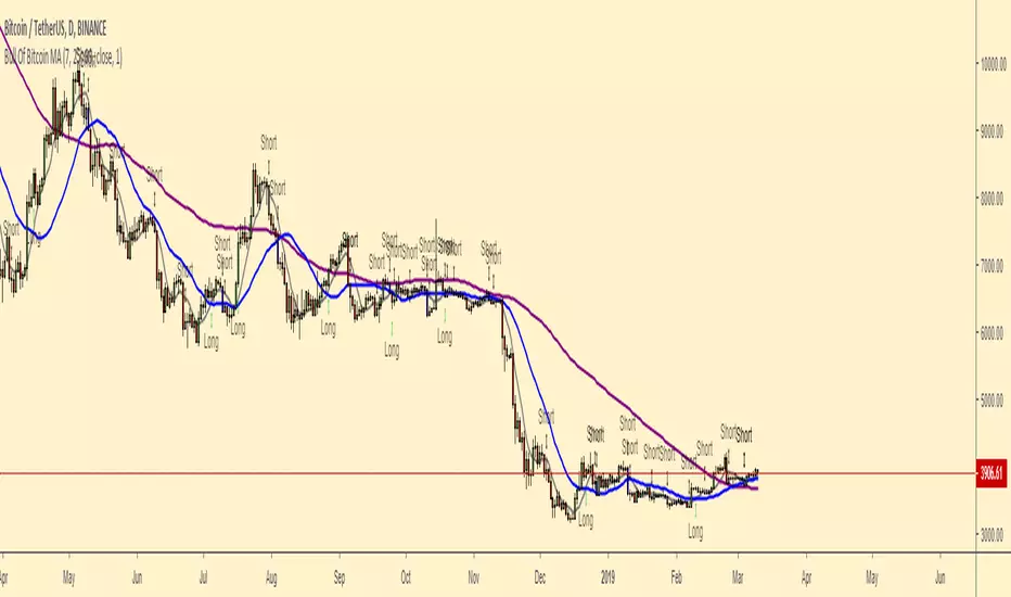
Bull Of Bitcoin MABullOfBitcoin MA
From studies conducted by Bull Of Bitcoin
Coding performed by GM_Hedge_Fund
The study is focused on the interactions of the candles with the 7 and 25 Moving Averages.
The script:
Plots 7 (grey), 25 (blue) and 99 (purple) MA on the chart in overlay
Signals a possible Long Entry when the 7MA crosses the 25MA
Signals a possible Short Sell when the second candle that closes under the 7MA
Signals a possible Short Sell (stronger than the previous one) when the first candle that closes under the 25 MA
Suggestions:
The script is meant to be displayed on a naked chart (no other indicators) with light background to facilitate the reading.
The script is complete with alarms and notifications that can be enabled with the button alarm on the right toolbar.
---------------------------------------------------------------------------------------------------------------------------------------------
If you enjoy please consider to support BullOfBitcoin by joining his Telegram, Twitter and Simon following on Twitter, TradingView and by sharing their script.
Twitter
@Bull0fBitcoin
@simonbakercryto
TradingView
@GM_Hedge_Fund
Bitcoin Pine Script - Tom Hall StrategyThe Bitcoin script is a combination of crucial indicators that align across multiple timeframes.
How To Apply The Script:
Apply the script to your chart by clicking the ( Add to Favourite Scripts )\u2028
BSO = Buy Stop Order
The BSO symbol will appear once a valid trade opportunity presents itself.\u2028
Once the BSO candle closes it will provide you the parameters for a Buy Stop Order.
Orange Horizontal Line = Buy Stop Order Entry
Green Horizontal Line = Take Profit
Red Horizontal Line = Stop Loss
Key Information:
(1) The BSO is valid for a period of 24 hours, should price not trigger a live position the BSO must be cancelled.
(2) The horizontal lines that track price action are only relevant once a BSO candle has closed.
Alert System:
The alert system allows you to receive SMS / Email notifications in addition to a screen notification providing you information a BSO is required.
How To Apply The Alert System:
(1) Windows Press ( ALT + A ) / MacBook Press ( Option + A )
(2) Adjust the condition section from BTCUSD to Tom Hall Strategy\u2028
(3) Two crucial boxes will appear, The Lowest EMA and Buy Stop Order.
(4) Click create, this will allow you to receive Email / SMS notifications once a valid trade opportunity is available.\u2028
Profitable Edge:
Data From: 31st March 2013
Positions Executed: 76
Profitable Trades: 52
Losing Traders: 24\u2028
Risk / Reward: 1:1
Strike Rate / Profitable Edge: 68.43%
2013: 80% Profitable ( 10 Positions )
2014: 60% Profitable ( 5 Positions )
2015: 75% Profitable ( 16 Positions )
2016: 45% Profitable ( 20 Positions )
2017: 82.61% Profitable ( 23 Positions )
Style / Inputs:
All visible parameters can be adjusted to individual taste and preference.

Yield Ratio ViewerUtilizes for yield and buy hold positions using the "Volume & Intraday Script" as well as the acculturation and distribution views script. The point of this is to backtest long holds for past strategies in a trading script. Math and logic still would need to be added with higher frequency to make this more efficient with the script that you would be utilizing for trading. This should work well for both cryptocurrency and forex trading as well as binary options bots that follow the modulus formula.
Forex session - Opening Range- Jayy fixed updatedOpening Range (OR) for Forex 24 hour regular session. This is not for regular market day sessions addressed in a separate script.
This script fixes four issues:
syntax error when code compiles
messed up opening range the day after a holiday Monday
flaky plotting of the opening range and targets that required page reloading
TradingView problems with starting forex session at 1700 hours EST/EDT when using certain securities eg FX_IDC currently (Jan 2017)
Additions in his code are more options for trading range
Time compensation option for some securities that incorrectly start sessions at 1200 hrs instead of 1700 hrs NY time
- this glitch is likely temporary but present when this script update was created
More opening range time period choices
Opening Range Targets:
Opening Range Targets as per Leaf_West
Targets are set at 127% , 162%, 200 %, 262 %, 362%, 423%, 685%, 1109% and 1794% and this can be traded intraday using methods described here charts-by-leaf.com I also have some Leaf West PDFs that describe how the targets are set and how they are traded. There are others that use opening range.
The Time Session Glitch and the Fix:
The script will correctly default to 1700 hrs to 1700hrs EDT/EST session for FXCM.
Strangely some securities appear to erroneously start their session at 1200 hrs ie. My guess is that they are somehow tied to GMT+0 instead of New York time (GMT+5). See this for yourself by selecting EURUSD using the FXCM exchange (FX:EURUSD) and then EURUSD from the IDC exchange (FX_IDC:EURUSD). The FX-IDC session opening range starts 5 hours
before it actually should at 1700 hrs EDT/EST. To correct for this I have implemented an automatic fix (default) and a user selected "5 hour time shift adjust. ment needed on some securities".
There is also a 4 hour time shift button which might be necessary when New York reverts from Eastern Standard Time
to Eastern Daylight Time (1 hour difference) in March (and then back again in November). In the default auto adjust mode you will need to select the 1 hour time shift. That is if this glitch still exists at that time.
I have looked at other scripts, other than my own and where the script is available, that need to use information about the opening bar and all have the same time shift issue
What are the choices for Opening Range?
The dialogue box offers the standard TradingView options.
Also where you see Pick Opening Range 1 to 12 hours , SET TO 0 To USE LINE ABOVE TO DETERMINE OR LENGTH
As the note says a number other than 0 will override the standard options from the line above
The dialogue box below in offers choices by hours 1 to 12. A number greater than 12 will still only give
720 minutes (12 hours) for the length of Opening Range.
What sessions within the FOREX time-frame are available?
The default is 1700 hours to 1700 hours EST/EDT
Check any one (only one) of the time periods to change the opening range period to suit.
New York opens at 8:00 am to 5:00 pm EST (EDT)
Tokyo opens at 7:00 pm to 4:00 am EST (EDT)
Sydney opens at 5:00 pm to 2:00 am EST (EDT)
London opens at 3:00 am to 12:00 noon EST (EDT)
There is a build your own session (click the button to select)
The two lines for inputting session times are almost identical except that the second line starts the be the same as each other.
The default for the build your own session is 2200 hours to 2200 hours. As of the time of publishing this plots EURUSD FX-IDC just right. The GMT+5 and GMT+4 do not apply to this selection.
See my comments above on this strange aberration.
The script originated from work done by Chris Moody. It has changed significantly but there are remnants of that script lurking within.
Script is free to all - that way you can see what is inside
Cheers Jayy

CoreMACDHTF [CHE]Library "CoreMACDHTF"
calc_macd_htf(src, preset_str, smooth_len)
Parameters:
src (float)
preset_str (simple string)
smooth_len (int)
is_hist_rising(src, preset_str, smooth_len)
Parameters:
src (float)
preset_str (simple string)
smooth_len (int)
hist_rising_01(src, preset_str, smooth_len)
Parameters:
src (float)
preset_str (simple string)
smooth_len (int)
CoreMACDHTF — Hardcoded HTF MACD Presets with Smoothed Histogram Regime Flags
Summary
CoreMACDHTF provides a reusable MACD engine that approximates higher-timeframe behavior by selecting hardcoded EMA lengths based on the current chart timeframe, then optionally smoothing the resulting histogram with a stateful filter. It is published as a Pine v6 library but intentionally includes a minimal demo plot so you can validate behavior directly on a chart. The primary exported outputs are MACD, signal, a smoothed histogram, and the resolved lengths plus a timeframe tag. In addition, it exposes a histogram rising condition so importing scripts can reuse the same regime logic instead of re-implementing it.
Motivation: Why this design?
Classic MACD settings are often tuned to one timeframe. When you apply the same parameters to very different chart intervals, the histogram can become either too noisy or too sluggish. This script addresses that by using a fixed mapping from the chart timeframe into a precomputed set of EMA lengths, aiming for more consistent “tempo” across intervals. A second problem is histogram micro-chop around turning points; the included smoother reduces short-run flips so regime-style conditions can be more stable for alerts and filters.
What’s different vs. standard approaches?
Reference baseline: a standard MACD using fixed fast, slow, and signal lengths on the current chart timeframe.
Architecture differences:
Automatic timeframe bucketing that selects a hardcoded length set for the chosen preset.
Two preset families: one labeled A with lengths three, ten, sixteen; one labeled B with lengths twelve, twenty-six, nine.
A custom, stateful histogram smoother intended to damp noisy transitions.
Library exports that return both signals and metadata, plus a dedicated “histogram rising” boolean.
Practical effect:
The MACD lengths change when the chart timeframe changes, so the oscillator’s responsiveness is not constant across intervals by design.
The rising-flag logic is based on the smoothed histogram, which typically reduces single-bar flip noise compared to using the raw histogram directly.
How it works (technical)
1. The script reads the chart timeframe and converts it into milliseconds using built-in timeframe helpers.
2. It assigns the timeframe into a bucket label, such as an intraday bucket or a daily-and-above bucket, using fixed thresholds.
3. It resolves a hardcoded fast, slow, and signal length triplet based on:
The selected preset family.
The bucket label.
In some cases, the current minute multiplier for finer mapping.
4. It computes fast and slow EMAs on the selected source and subtracts them to obtain MACD, then computes an EMA of MACD for the signal line.
5. The histogram is derived from the difference between MACD and signal, then passed through a custom smoother.
6. The smoother uses persistent internal state to carry forward its intermediate values from bar to bar. This is intentional and means the smoothing output depends on contiguous bar history.
7. The histogram rising flag compares the current smoothed histogram to its prior value. On the first comparable bar it defaults to “rising” to avoid a missing prior reference.
8. Exports:
A function that returns MACD, signal, smoothed histogram, the resolved lengths, and a text tag.
A function that returns the boolean rising state.
A function that returns a numeric one-or-zero series for direct plotting or downstream numeric logic.
HTF note: this is not a true higher-timeframe request. It does not fetch higher-timeframe candles. It approximates HTF feel by selecting different lengths on the current timeframe.
Parameter Guide
Source — Input price series used for EMA calculations — Default close — Trade-offs/Tips
Preset — Selects the hardcoded mapping family — Default preset A — Preset A is more reactive than preset B in typical use
Table Position — Anchor for an information table — Default top right — Present but not wired in the provided code (Unknown/Optional)
Table Size — Text size for the information table — Default normal — Present but not wired in the provided code (Unknown/Optional)
Dark Mode — Theme toggle for the table — Default enabled — Present but not wired in the provided code (Unknown/Optional)
Show Table — Visibility toggle for the table — Default enabled — Present but not wired in the provided code (Unknown/Optional)
Zero dead-band (epsilon) — Intended neutral band around zero for regime classification — Default zero — Present but not used in the provided code (Unknown/Optional)
Acceptance bars (n) — Intended debounce count for regime confirmation — Default three — Present but not used in the provided code (Unknown/Optional)
Smoothing length — Length controlling the histogram smoother’s responsiveness — Default nine — Smaller values react faster but can reintroduce flip noise
Reading & Interpretation
Smoothed histogram: use it as the momentum core. A positive value implies MACD is above signal, a negative value implies the opposite.
Histogram rising flag:
True means the smoothed histogram increased compared to the prior bar.
False means it did not increase compared to the prior bar.
Demo plot:
The included plot outputs one when rising is true and zero otherwise. It is a diagnostic-style signal line, not a scaled oscillator display.
Practical Workflows & Combinations
Trend following:
Use rising as a momentum confirmation filter after structural direction is established by higher highs and higher lows, or lower highs and lower lows.
Combine with a simple trend filter such as a higher-timeframe moving average from your main script (Unknown/Optional).
Exits and risk management:
If you use rising to stay in trends, consider exiting or reducing exposure when rising turns false for multiple consecutive bars rather than reacting to a single flip.
If you build alerts, evaluate on closed bars to avoid intra-bar flicker in live candles.
Multi-asset and multi-timeframe:
Because the mapping is hardcoded, validate on each asset class you trade. Volatility regimes differ and the perceived “equivalence” across timeframes is not guaranteed.
For consistent behavior, keep the smoothing length aligned across assets and adjust only when flip frequency becomes problematic.
Behavior, Constraints & Performance
Repaint and confirmation:
There is no forward-looking indexing. The logic uses current and prior values only.
Live-bar values can change until the bar closes, so rising can flicker intra-bar if you evaluate it in real time.
security and HTF:
No higher-timeframe candle requests are used. Length mapping is internal and deterministic per chart timeframe.
Resources:
No loops and no arrays in the core calculation path.
The smoother maintains persistent state, which is lightweight but means results depend on uninterrupted history.
Known limits:
Length mappings are fixed. If your chart timeframe is unusual, the bucket choice may not represent what you expect.
Several table and regime-related inputs are declared but not used in the provided code (Unknown/Optional).
The smoother is stateful; resetting chart history or changing symbol can alter early bars until state settles.
Sensible Defaults & Quick Tuning
S tarting point:
Preset A
Smoothing length nine
Source close
Tuning recipes:
Too many flips: increase smoothing length and evaluate rising only on closed bars.
Too sluggish: reduce smoothing length, but expect more short-run reversals.
Different timeframe feel after switching intervals: keep preset fixed and adjust smoothing length first before changing preset.
Want a clean plot signal: use the exported numeric rising series and apply your own display rules in the importing script.
What this indicator is—and isn’t
This is a momentum and regime utility layer built around a MACD-style backbone with hardcoded timeframe-dependent parameters and an optional smoother. It is not a complete trading system, not a risk model, and not predictive. Use it in context with market structure, execution rules, and risk controls.
Disclaimer
The content provided, including all code and materials, is strictly for educational and informational purposes only. It is not intended as, and should not be interpreted as, financial advice, a recommendation to buy or sell any financial instrument, or an offer of any financial product or service. All strategies, tools, and examples discussed are provided for illustrative purposes to demonstrate coding techniques and the functionality of Pine Script within a trading context.
Any results from strategies or tools provided are hypothetical, and past performance is not indicative of future results. Trading and investing involve high risk, including the potential loss of principal, and may not be suitable for all individuals. Before making any trading decisions, please consult with a qualified financial professional to understand the risks involved.
By using this script, you acknowledge and agree that any trading decisions are made solely at your discretion and risk.
Do not use this indicator on Heikin-Ashi, Renko, Kagi, Point-and-Figure, or Range charts, as these chart types can produce unrealistic results for signal markers and alerts.
Best regards and happy trading
Chervolino

SMC Structures and Multi-Timeframe FVG PYSMC Structures and Multi-Timeframe FVG Indicator
Tip: For optimal performance, adjust the number of FVGs displayed per timeframe in the settings. On high-performance devices, up to 8 FVGs per timeframe can be used without issues. If you experience slowdowns, reduce to 3 or 4 FVGs per timeframe. If the chart flashes, disable indicators one by one to identify conflicts, or try using the TradingView Mobile or Windows App for a smoother experience.
Overview
This Pine Script indicator enhances market analysis by integrating Smart Money Concepts (SMC) with Fair Value Gaps (FVG) across multiple timeframes. It identifies trend continuations (Break of Structure, BOS) and trend reversals (Change of Character, CHoCH) while highlighting liquidity zones through FVG detection. The indicator includes eight customizable Moving Average (MA) curve templates, disabled by default, to complement SMC and FVG analysis. Its originality lies in combining multi-timeframe FVG detection with SMC structure analysis, providing traders with a cohesive tool to visualize price action patterns and liquidity zones efficiently.
Features and Functionality
1. Fair Value Gaps (FVG)
The indicator detects and displays bullish, bearish, and mitigated FVGs, representing liquidity zones where price inefficiencies occur. These gaps are dynamically updated based on price action:
Bullish FVG: Displayed in green when unmitigated, indicating potential upward liquidity zones.
Bearish FVG: Displayed in red when unmitigated, signaling potential downward liquidity zones.
Mitigated FVG: Shown in gray once the gap is partially filled by price action.
Fully Mitigated FVG: Automatically removed from the chart when the gap is fully filled, reducing visual clutter.
Users can customize the number of historical FVGs displayed via the settings, allowing focus on recent liquidity zones for targeted analysis.
2. SMC Structures
The indicator identifies key SMC price action patterns:
Break of Structure (BOS): Marked with gray lines, indicating trend continuation when price breaks a significant high or low.
Change of Character (CHoCH): Highlighted with yellow lines, signaling potential trend reversals when price fails to maintain the current structure.
High/Low Values: Blue lines denote the highest high and lowest low of the current structure, providing reference points for market context.
3. Multi-Timeframe FVG Analysis
A standout feature is the ability to analyze FVGs across multiple timeframes simultaneously. This allows traders to align higher-timeframe liquidity zones with lower-timeframe entries, improving trade precision. The indicator fetches FVG data from user-selected timeframes, displaying them cohesively on the chart.
4. Moving Average (MA) Templates
The indicator includes eight customizable MA curve templates in the Settings > Template section, disabled by default. These templates allow users to overlay MAs (e.g., SMA, EMA, WMA) to complement SMC and FVG analysis. Each template is pre-configured with different periods and types, enabling quick adaptation to various trading strategies, such as trend confirmation or dynamic support/resistance.
How It Works
The script processes price action to detect FVGs by analyzing three-candle patterns where a gap forms between the high/low of the first and third candles. Multi-timeframe data is retrieved using Pine Script’s request.security() function, ensuring accurate FVG plotting across user-defined timeframes. BOS and CHoCH are identified by tracking swing highs and lows, with logic to differentiate trend continuation from reversals. The MA templates are computed using standard Pine Script TA functions, with user inputs controlling visibility and parameters.
How to Use
Add to Chart: Apply the indicator to any TradingView chart.
Configure Settings:
FVG Settings: Adjust the number of historical FVGs to display (default: 10). Enable/disable specific FVG types (bullish, bearish, mitigated).
Timeframe Selection: Choose up to three timeframes for FVG analysis (e.g., 1H, 4H, 1D) to align with your trading strategy.
Structure Settings: Toggle BOS (gray lines) and CHoCH (yellow lines) visibility. Adjust sensitivity for structure detection if needed.
MA Templates: Enable MA curves via the Template section. Select from eight pre-configured MA types and periods to suit your analysis.
Interpret Signals:
Use green/red FVGs for potential entry points targeting liquidity zones.
Monitor gray lines (BOS) for trend continuation and yellow lines (CHoCH) for reversal signals.
Align multi-timeframe FVGs with BOS/CHoCH for high-probability setups.
Optionally, use MA curves for trend confirmation or dynamic levels.
Clean Chart Usage: The indicator is designed to work standalone. Ensure no conflicting scripts are applied unless explicitly needed for your strategy.
Why This Indicator Is Unique
Unlike standalone FVG or SMC indicators, this script combines both concepts with multi-timeframe analysis, offering a comprehensive view of market structure and liquidity. The addition of customizable MA templates enhances flexibility, while the dynamic removal of mitigated FVGs keeps the chart clean. This mashup is purposeful, as it integrates complementary tools to streamline decision-making for traders using SMC strategies.
Credits
This indicator builds on foundational SMC and FVG concepts from the TradingView community. Some open-source code was reused, and do performance enhancement as you guys can read the code. This type of indicators has inspiration was drawn from public domain SMC methodologies. All code is partly original with manual work on performance optimization in Pine Script.
Notes
Ensure your chart is clean (no unnecessary drawings or indicators) to maximize clarity.
The indicator is open-source, and traders are encouraged to review the code for deeper understanding.
For optimal use, test the indicator on a demo account to familiarize yourself with its signals.

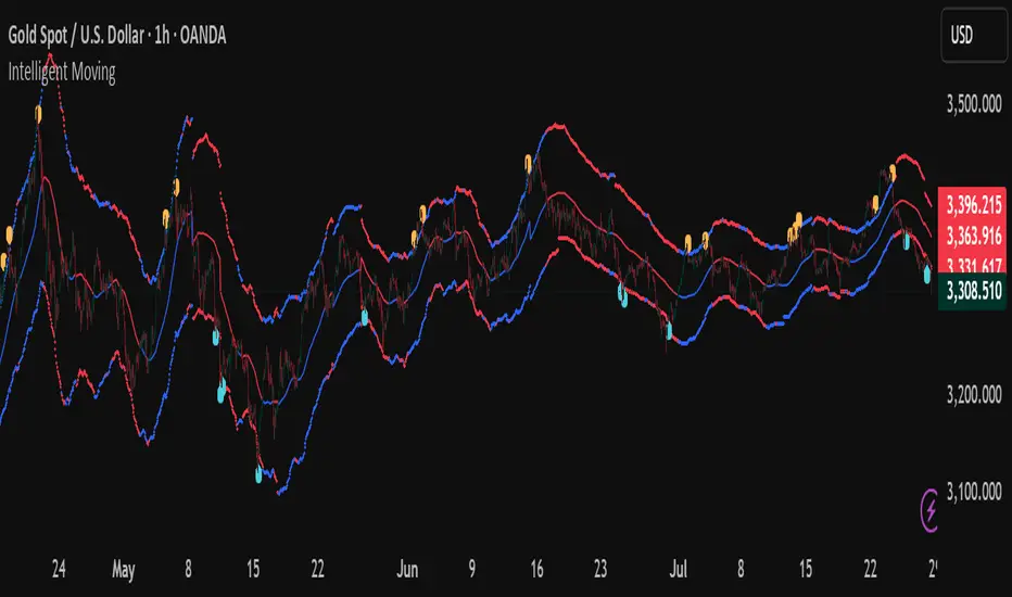
Intelligent Moving📘 Intelligent Moving – Adaptive Neural Trend Engine
Intelligent Moving is an invite-only, closed-source indicator that dynamically adjusts itself to evolving market conditions using a built-in neural optimizer. It combines a custom adaptive Moving Average, ATR-based deviation bands, and a fully internal virtual trade simulator to deliver smart trend signals and automatic parameter tuning — all without repainting or manual intervention.
This script is built entirely from original code and does not use any open-source components or built-in TradingView indicators.
🧠 Core Logic and Visual Structure
The indicator plots:
- A central moving average (optimized dynamically),
- Upper and lower deviation bands based on ATR × adaptive coefficients,
- Buy (aqua) and Sell (orange) arrows on reversion signals,
- Color-coded trend zones based on price vs. moving average.
All three bands change color in real time depending on the price’s position relative to the MA, clearly showing uptrends (e.g. blue) and downtrends (e.g. red).
📈 Signal Logic: Reversion from Extremes
- Buy Signal: After price closes below the lower deviation band, it then closes back above it.
- Sell Signal: After price closes above the upper deviation band, it then closes back below it.
These signals are not based on crossovers, oscillators, or lagging logic — they are pure structure-based reversion entries, designed to detect exhaustion and reversal zones.
🤖 Built-In Neural Optimizer (Perceptron Engine)
At the heart of Intelligent Moving lies a self-training engine that uses simulated (virtual) positions to test multiple configurations and pick the best one. Here’s how it works:
🔄 Virtual Trade Simulation
At regular intervals (user-defined), the script:
- Simulates virtual buy/sell positions based on its signal logic.
- Applies virtual Stop-Loss (just beyond the signal zone) and virtual Take-Profit (when price crosses back over the MA).
- Calculates simulated profit for each combination of:
- - MA periods,
- - Upper/lower ATR multipliers.
🧠 Neural Training Process
- A perceptron-like engine evaluates the simulated results.
- It selects the best-performing configuration and applies it to live plotting.
- You can choose whether optimization uses a base value or the last best result from the previous training pass.
This process runs forward-only and never overwrites history or uses future data. It's completely transparent and non-repainting.
⚙️ Customization and Parameters
Users can control:
- MA period range, step, and training type (base vs last best)
- Deviation multiplier ranges and step
- Training depth (number of bars in history)
- Training interval (how often to retrain)
- Spread simulation, alert options, and all visual settings
💡 What Makes It Unique
- ✅ Self-optimization with virtual trades and perceptron logic
- ✅ Adaptive deviation bands based on ATR (not standard deviation)
- ✅ No built-in indicators, no repaints, no curve-fitting
- ✅ Clear trend zones and reversal signals
- ✅ Optimized for live use and consistent behavior across assets
Unlike typical moving average tools, Intelligent Moving thinks, adapts, and reacts — turning a standard concept into a living, learning trend engine.
📊 Use Cases
- Trend detection with adaptive coloring
- Reversion trading from volatility extremes
- Dynamic strategy building with minimal manual input
- Alerts for automated or discretionary traders
🔒 Invite-Only Notice
This script is invite-only and closed-source.
The optimization logic, trade simulation system, and perceptron engine were developed from scratch, specifically for this indicator. No built-in functions (e.g. MA, BB, RSI) or public scripts were used or copied.
All decisions and calculations are based on current and past price only — no repainting, retrofitting, or future leakage.
⚠️ Disclaimer
This indicator is for educational and analytical use only.
It does not predict future prices or guarantee profits. Always use appropriate risk management and test thoroughly before live trading.
Multi-Timeframe SMTSummery
The Multi-Timeframe SMT indicator is designed to identify and visualize Higher Timeframe (HTF) data on a Lower Timeframe (LTF) chart, allowing traders to see the broader market context without changing their current chart's resolution. It accurately draws pivots and SMT divergences from higher timeframes on the corresponding candles of your current lower timeframe chart.
Its core features include:
Multi-Timeframe Analysis: Configure and monitor pivots on up to four independent timeframes, from intraday to monthly.
Customizable Pivot Detection: Define the strength of pivots by adjusting the number of bars to the left and right.
SMT Divergence: Automatically identifies bullish and bearish SMT divergences by comparing the price action of the main chart symbol with a chosen correlated asset.
Early SMT Detection: A unique feature that monitors a lower "detection timeframe" to provide early warnings of potential SMT setups before they're confirmed on the main timeframe. Note that this early detection is only shown on timeframes equal to or lower than the "Detection timeframe" you have set.
Visual Cues & Alerts: Clear on-chart labels, lines, and fully customizable alerts notify you of confirmed pivots and SMT divergences, ensuring you don't miss key opportunities.
Important Nuance Regarding Pivot Label Display
Due to a self-imposed limit within this script's drawing management logic, the indicator might quickly reach its drawing capacity if you enable pivot crosses for multiple timeframes simultaneously. When this internal drawing limit is exceeded, the script is designed to automatically remove the oldest drawings to make space for new ones.
Therefore, to ensure optimal performance and visibility of the most recent and relevant pivots, it's highly recommended to only enable the "Show Pivot Crosses" option for one timeframe at a time. If you wish to view pivots for a different timeframe, simply disable the pivot crosses for the currently active timeframe and then enable them for your desired one. This approach prevents the rapid cycling and disappearance of pivot labels, providing a clearer and more stable visual experience.
In-Depth Explanation of the Logic
This script is built on two primary concepts: pivot points and Smart Money Technique (SMT) divergence. It systematically collects historical data on multiple timeframes, identifies pivots, and then compares them between two assets to find divergences.
Pivot Point Identification
A pivot is a turning point in the market. A pivot high is a candle that has a higher high than the candles to its immediate left and right. Conversely, a pivot low is a candle with a lower low than its neighbors.
How it Works in the Script:
The script tracks the highest high and lowest low for each period of the selected timeframe (e.g., for each 4-hour candle). When a new high-timeframe candle closes, it stores that high/low value and its bar index in an array. The checkForPivot() function then checks if a recently stored high or low qualifies as a pivot.
Key Inputs:
Left Strength (leftBars1): The number of candles to the left that must have a lower high (for a pivot high) or higher low (for a pivot low).
Right Strength (rightBars1): The number of candles to the right that must meet the same criteria.
For example, with Left Strength and Right Strength both set to 3, a pivot high is only confirmed when its high is greater than the highs of the 3 previous high-timeframe candles and the 3 subsequent high-timeframe candles. Increasing these values will identify more significant, longer-term pivots.
Smart Money Technique (SMT) Divergence
SMT Divergence is a concept popularized by The Inner Circle Trader (ICT). It occurs when two closely correlated assets fail to move in sync. For instance, if Asset A makes a higher high but Asset B fails to do so and instead makes a lower high, this creates a bearish SMT divergence. It suggests that the "smart money" may not be supporting the move in Asset A, signaling a potential reversal.
Bearish SMT: Main asset makes a higher high, while the correlated asset makes a lower high. This is a potential sell signal.
Bullish SMT: Main asset makes a lower low, while the correlated asset makes a higher low. This is a potential buy signal.
How it Works in the Script:
Data Request: For each timeframe, the script uses the request.security() function to fetch the high and low data for both the main chart symbol (syminfo.tickerid) and the chosen Comparison Asset.
Pivot Comparison: When a new pivot is confirmed on the main asset, the script checks if a corresponding pivot also formed on the comparison asset at the same time.
Divergence Check: It then compares the direction of the pivots. For a bearish SMT, it checks if the main asset's new pivot high is higher than its previous pivot high, while the comparison asset's new pivot high is lower than its previous one. The logic is reversed for bullish SMT.
Visualization: If a divergence is found, the script draws a red (bearish) or green (bullish) line connecting the two pivots on your chart and places an "SMT" label.
Early SMT Detection
This is a proactive feature designed to give you a heads-up. Waiting for a 4-hour or daily pivot to form can take a long time. The early detection system looks for SMT divergences on a much smaller, user-defined Detection timeframe (e.g., 15-minute).
How it Works in the Script:
Awaiting Setup: After a primary pivot (Pivot A) is formed on the main timeframe (e.g., a Daily pivot high), the script begins monitoring.
Intraday Monitoring: It then watches the Detection timeframe (e.g., 15-minute) for smaller intraday pivots.
Potential Divergence: It looks for an intraday pivot that forms a divergence against the primary Pivot A.
Watchline & Alert: When this "potential" divergence occurs, the script draws a dashed white line and triggers a "Potential SMT" alert. This isn't a confirmed SMT on the main timeframe yet, but it's a powerful early warning that one may be forming.
Drawing & Object Management
To keep the chart clean and prevent performance issues, the script manages its drawings (lines and labels) efficiently. It stores them in arrays and uses a drawing limit to automatically delete the oldest drawings as new ones are created, ensuring your TradingView remains responsive.
How to Use the Indicator
Configuration
Enable Timeframes: Use the checkboxes (Enable Timeframe 1, Enable Timeframe 2, etc.) to activate the timeframes you want to monitor. It's often best to start with one or two to keep the chart clean.
Select Timeframes: Choose the higher timeframes you want to analyze (e.g., 240 for 4-hour, D for Daily, W for Weekly).
Set Pivot Strength: The default of 3 for Left/Right strength is a good starting point. Increase it to find more significant market structure points or decrease it for more frequent, shorter-term pivots.
Configure SMT:
Check Enable SMT for the timeframes where you want to detect divergence.
Enter a Comparison Asset . This is crucial. Ensure the assets are correlated.
To use the early warning system, check Enable early SMT detection and select an appropriate Detection timeframe (e.g., 15 or 60 minutes for a Daily analysis).

ValueAtTime█ OVERVIEW
This library is a Pine Script® programming tool for accessing historical values in a time series using UNIX timestamps . Its data structure and functions index values by time, allowing scripts to retrieve past values based on absolute timestamps or relative time offsets instead of relying on bar index offsets.
█ CONCEPTS
UNIX timestamps
In Pine Script®, a UNIX timestamp is an integer representing the number of milliseconds elapsed since January 1, 1970, at 00:00:00 UTC (the UNIX Epoch ). The timestamp is a unique, absolute representation of a specific point in time. Unlike a calendar date and time, a UNIX timestamp's meaning does not change relative to any time zone .
This library's functions process series values and corresponding UNIX timestamps in pairs , offering a simplified way to identify values that occur at or near distinct points in time instead of on specific bars.
Storing and retrieving time-value pairs
This library's `Data` type defines the structure for collecting time and value information in pairs. Objects of the `Data` type contain the following two fields:
• `times` – An array of "int" UNIX timestamps for each recorded value.
• `values` – An array of "float" values for each saved timestamp.
Each index in both arrays refers to a specific time-value pair. For instance, the `times` and `values` elements at index 0 represent the first saved timestamp and corresponding value. The library functions that maintain `Data` objects queue up to one time-value pair per bar into the object's arrays, where the saved timestamp represents the bar's opening time .
Because the `times` array contains a distinct UNIX timestamp for each item in the `values` array, it serves as a custom mapping for retrieving saved values. All the library functions that return information from a `Data` object use this simple two-step process to identify a value based on time:
1. Perform a binary search on the `times` array to find the earliest saved timestamp closest to the specified time or offset and get the element's index.
2. Access the element from the `values` array at the retrieved index, returning the stored value corresponding to the found timestamp.
Value search methods
There are several techniques programmers can use to identify historical values from corresponding timestamps. This library's functions include three different search methods to locate and retrieve values based on absolute times or relative time offsets:
Timestamp search
Find the value with the earliest saved timestamp closest to a specified timestamp.
Millisecond offset search
Find the value with the earliest saved timestamp closest to a specified number of milliseconds behind the current bar's opening time. This search method provides a time-based alternative to retrieving historical values at specific bar offsets.
Period offset search
Locate the value with the earliest saved timestamp closest to a defined period offset behind the current bar's opening time. The function calculates the span of the offset based on a period string . The "string" must contain one of the following unit tokens:
• "D" for days
• "W" for weeks
• "M" for months
• "Y" for years
• "YTD" for year-to-date, meaning the time elapsed since the beginning of the bar's opening year in the exchange time zone.
The period string can include a multiplier prefix for all supported units except "YTD" (e.g., "2W" for two weeks).
Note that the precise span covered by the "M", "Y", and "YTD" units varies across time. The "1M" period can cover 28, 29, 30, or 31 days, depending on the bar's opening month and year in the exchange time zone. The "1Y" period covers 365 or 366 days, depending on leap years. The "YTD" period's span changes with each new bar, because it always measures the time from the start of the current bar's opening year.
█ CALCULATIONS AND USE
This library's functions offer a flexible, structured approach to retrieving historical values at or near specific timestamps, millisecond offsets, or period offsets for different analytical needs.
See below for explanations of the exported functions and how to use them.
Retrieving single values
The library includes three functions that retrieve a single stored value using timestamp, millisecond offset, or period offset search methods:
• `valueAtTime()` – Locates the saved value with the earliest timestamp closest to a specified timestamp.
• `valueAtTimeOffset()` – Finds the saved value with the earliest timestamp closest to the specified number of milliseconds behind the current bar's opening time.
• `valueAtPeriodOffset()` – Finds the saved value with the earliest timestamp closest to the period-based offset behind the current bar's opening time.
Each function has two overloads for advanced and simple use cases. The first overload searches for a value in a user-specified `Data` object created by the `collectData()` function (see below). It returns a tuple containing the found value and the corresponding timestamp.
The second overload maintains a `Data` object internally to store and retrieve values for a specified `source` series. This overload returns a tuple containing the historical `source` value, the corresponding timestamp, and the current bar's `source` value, making it helpful for comparing past and present values from requested contexts.
Retrieving multiple values
The library includes the following functions to retrieve values from multiple historical points in time, facilitating calculations and comparisons with values retrieved across several intervals:
• `getDataAtTimes()` – Locates a past `source` value for each item in a `timestamps` array. Each retrieved value's timestamp represents the earliest time closest to one of the specified timestamps.
• `getDataAtTimeOffsets()` – Finds a past `source` value for each item in a `timeOffsets` array. Each retrieved value's timestamp represents the earliest time closest to one of the specified millisecond offsets behind the current bar's opening time.
• `getDataAtPeriodOffsets()` – Finds a past value for each item in a `periods` array. Each retrieved value's timestamp represents the earliest time closest to one of the specified period offsets behind the current bar's opening time.
Each function returns a tuple with arrays containing the found `source` values and their corresponding timestamps. In addition, the tuple includes the current `source` value and the symbol's description, which also makes these functions helpful for multi-interval comparisons using data from requested contexts.
Processing period inputs
When writing scripts that retrieve historical values based on several user-specified period offsets, the most concise approach is to create a single text input that allows users to list each period, then process the "string" list into an array for use in the `getDataAtPeriodOffsets()` function.
This library includes a `getArrayFromString()` function to provide a simple way to process strings containing comma-separated lists of periods. The function splits the specified `str` by its commas and returns an array containing every non-empty item in the list with surrounding whitespaces removed. View the example code to see how we use this function to process the value of a text area input .
Calculating period offset times
Because the exact amount of time covered by a specified period offset can vary, it is often helpful to verify the resulting times when using the `valueAtPeriodOffset()` or `getDataAtPeriodOffsets()` functions to ensure the calculations work as intended for your use case.
The library's `periodToTimestamp()` function calculates an offset timestamp from a given period and reference time. With this function, programmers can verify the time offsets in a period-based data search and use the calculated offset times in additional operations.
For periods with "D" or "W" units, the function calculates the time offset based on the absolute number of milliseconds the period covers (e.g., `86400000` for "1D"). For periods with "M", "Y", or "YTD" units, the function calculates an offset time based on the reference time's calendar date in the exchange time zone.
Collecting data
All the `getDataAt*()` functions, and the second overloads of the `valueAt*()` functions, collect and maintain data internally, meaning scripts do not require a separate `Data` object when using them. However, the first overloads of the `valueAt*()` functions do not collect data, because they retrieve values from a user-specified `Data` object.
For cases where a script requires a separate `Data` object for use with these overloads or other custom routines, this library exports the `collectData()` function. This function queues each bar's `source` value and opening timestamp into a `Data` object and returns the object's ID.
This function is particularly useful when searching for values from a specific series more than once. For instance, instead of using multiple calls to the second overloads of `valueAt*()` functions with the same `source` argument, programmers can call `collectData()` to store each bar's `source` and opening timestamp, then use the returned `Data` object's ID in calls to the first `valueAt*()` overloads to reduce memory usage.
The `collectData()` function and all the functions that collect data internally include two optional parameters for limiting the saved time-value pairs to a sliding window: `timeOffsetLimit` and `timeframeLimit`. When either has a non-na argument, the function restricts the collected data to the maximum number of recent bars covered by the specified millisecond- and timeframe-based intervals.
NOTE : All calls to the functions that collect data for a `source` series can execute up to once per bar or realtime tick, because each stored value requires a unique corresponding timestamp. Therefore, scripts cannot call these functions iteratively within a loop . If a call to these functions executes more than once inside a loop's scope, it causes a runtime error.
█ EXAMPLE CODE
The example code at the end of the script demonstrates one possible use case for this library's functions. The code retrieves historical price data at user-specified period offsets, calculates price returns for each period from the retrieved data, and then populates a table with the results.
The example code's process is as follows:
1. Input a list of periods – The user specifies a comma-separated list of period strings in the script's "Period list" input (e.g., "1W, 1M, 3M, 1Y, YTD"). Each item in the input list represents a period offset from the latest bar's opening time.
2. Process the period list – The example calls `getArrayFromString()` on the first bar to split the input list by its commas and construct an array of period strings.
3. Request historical data – The code uses a call to `getDataAtPeriodOffsets()` as the `expression` argument in a request.security() call to retrieve the closing prices of "1D" bars for each period included in the processed `periods` array.
4. Display information in a table – On the latest bar, the code uses the retrieved data to calculate price returns over each specified period, then populates a two-row table with the results. The cells for each return percentage are color-coded based on the magnitude and direction of the price change. The cells also include tooltips showing the compared daily bar's opening date in the exchange time zone.
█ NOTES
• This library's architecture relies on a user-defined type (UDT) for its data storage format. UDTs are blueprints from which scripts create objects , i.e., composite structures with fields containing independent values or references of any supported type.
• The library functions search through a `Data` object's `times` array using the array.binary_search_leftmost() function, which is more efficient than looping through collected data to identify matching timestamps. Note that this built-in works only for arrays with elements sorted in ascending order .
• Each function that collects data from a `source` series updates the values and times stored in a local `Data` object's arrays. If a single call to these functions were to execute in a loop , it would store multiple values with an identical timestamp, which can cause erroneous search behavior. To prevent looped calls to these functions, the library uses the `checkCall()` helper function in their scopes. This function maintains a counter that increases by one each time it executes on a confirmed bar. If the count exceeds the total number of bars, indicating the call executes more than once in a loop, it raises a runtime error .
• Typically, when requesting higher-timeframe data with request.security() while using barmerge.lookahead_on as the `lookahead` argument, the `expression` argument should be offset with the history-referencing operator to prevent lookahead bias on historical bars. However, the call in this script's example code enables lookahead without offsetting the `expression` because the script displays results only on the last historical bar and all realtime bars, where there is no future data to leak into the past. This call ensures the displayed results use the latest data available from the context on realtime bars.
Look first. Then leap.
█ EXPORTED TYPES
Data
A structure for storing successive timestamps and corresponding values from a dataset.
Fields:
times (array) : An "int" array containing a UNIX timestamp for each value in the `values` array.
values (array) : A "float" array containing values corresponding to the timestamps in the `times` array.
█ EXPORTED FUNCTIONS
getArrayFromString(str)
Splits a "string" into an array of substrings using the comma (`,`) as the delimiter. The function trims surrounding whitespace characters from each substring, and it excludes empty substrings from the result.
Parameters:
str (series string) : The "string" to split into an array based on its commas.
Returns: (array) An array of trimmed substrings from the specified `str`.
periodToTimestamp(period, referenceTime)
Calculates a UNIX timestamp representing the point offset behind a reference time by the amount of time within the specified `period`.
Parameters:
period (series string) : The period string, which determines the time offset of the returned timestamp. The specified argument must contain a unit and an optional multiplier (e.g., "1Y", "3M", "2W", "YTD"). Supported units are:
- "Y" for years.
- "M" for months.
- "W" for weeks.
- "D" for days.
- "YTD" (Year-to-date) for the span from the start of the `referenceTime` value's year in the exchange time zone. An argument with this unit cannot contain a multiplier.
referenceTime (series int) : The millisecond UNIX timestamp from which to calculate the offset time.
Returns: (int) A millisecond UNIX timestamp representing the offset time point behind the `referenceTime`.
collectData(source, timeOffsetLimit, timeframeLimit)
Collects `source` and `time` data successively across bars. The function stores the information within a `Data` object for use in other exported functions/methods, such as `valueAtTimeOffset()` and `valueAtPeriodOffset()`. Any call to this function cannot execute more than once per bar or realtime tick.
Parameters:
source (series float) : The source series to collect. The function stores each value in the series with an associated timestamp representing its corresponding bar's opening time.
timeOffsetLimit (simple int) : Optional. A time offset (range) in milliseconds. If specified, the function limits the collected data to the maximum number of bars covered by the range, with a minimum of one bar. If the call includes a non-empty `timeframeLimit` value, the function limits the data using the largest number of bars covered by the two ranges. The default is `na`.
timeframeLimit (simple string) : Optional. A valid timeframe string. If specified and not empty, the function limits the collected data to the maximum number of bars covered by the timeframe, with a minimum of one bar. If the call includes a non-na `timeOffsetLimit` value, the function limits the data using the largest number of bars covered by the two ranges. The default is `na`.
Returns: (Data) A `Data` object containing collected `source` values and corresponding timestamps over the allowed time range.
method valueAtTime(data, timestamp)
(Overload 1 of 2) Retrieves value and time data from a `Data` object's fields at the index of the earliest timestamp closest to the specified `timestamp`. Callable as a method or a function.
Parameters:
data (series Data) : The `Data` object containing the collected time and value data.
timestamp (series int) : The millisecond UNIX timestamp to search. The function returns data for the earliest saved timestamp that is closest to the value.
Returns: ( ) A tuple containing the following data from the `Data` object:
- The stored value corresponding to the identified timestamp ("float").
- The earliest saved timestamp that is closest to the specified `timestamp` ("int").
valueAtTime(source, timestamp, timeOffsetLimit, timeframeLimit)
(Overload 2 of 2) Retrieves `source` and time information for the earliest bar whose opening timestamp is closest to the specified `timestamp`. Any call to this function cannot execute more than once per bar or realtime tick.
Parameters:
source (series float) : The source series to analyze. The function stores each value in the series with an associated timestamp representing its corresponding bar's opening time.
timestamp (series int) : The millisecond UNIX timestamp to search. The function returns data for the earliest bar whose timestamp is closest to the value.
timeOffsetLimit (simple int) : Optional. A time offset (range) in milliseconds. If specified, the function limits the collected data to the maximum number of bars covered by the range, with a minimum of one bar. If the call includes a non-empty `timeframeLimit` value, the function limits the data using the largest number of bars covered by the two ranges. The default is `na`.
timeframeLimit (simple string) : (simple string) Optional. A valid timeframe string. If specified and not empty, the function limits the collected data to the maximum number of bars covered by the timeframe, with a minimum of one bar. If the call includes a non-na `timeOffsetLimit` value, the function limits the data using the largest number of bars covered by the two ranges. The default is `na`.
Returns: ( ) A tuple containing the following data:
- The `source` value corresponding to the identified timestamp ("float").
- The earliest bar's timestamp that is closest to the specified `timestamp` ("int").
- The current bar's `source` value ("float").
method valueAtTimeOffset(data, timeOffset)
(Overload 1 of 2) Retrieves value and time data from a `Data` object's fields at the index of the earliest saved timestamp closest to `timeOffset` milliseconds behind the current bar's opening time. Callable as a method or a function.
Parameters:
data (series Data) : The `Data` object containing the collected time and value data.
timeOffset (series int) : The millisecond offset behind the bar's opening time. The function returns data for the earliest saved timestamp that is closest to the calculated offset time.
Returns: ( ) A tuple containing the following data from the `Data` object:
- The stored value corresponding to the identified timestamp ("float").
- The earliest saved timestamp that is closest to `timeOffset` milliseconds before the current bar's opening time ("int").
valueAtTimeOffset(source, timeOffset, timeOffsetLimit, timeframeLimit)
(Overload 2 of 2) Retrieves `source` and time information for the earliest bar whose opening timestamp is closest to `timeOffset` milliseconds behind the current bar's opening time. Any call to this function cannot execute more than once per bar or realtime tick.
Parameters:
source (series float) : The source series to analyze. The function stores each value in the series with an associated timestamp representing its corresponding bar's opening time.
timeOffset (series int) : The millisecond offset behind the bar's opening time. The function returns data for the earliest bar's timestamp that is closest to the calculated offset time.
timeOffsetLimit (simple int) : Optional. A time offset (range) in milliseconds. If specified, the function limits the collected data to the maximum number of bars covered by the range, with a minimum of one bar. If the call includes a non-empty `timeframeLimit` value, the function limits the data using the largest number of bars covered by the two ranges. The default is `na`.
timeframeLimit (simple string) : Optional. A valid timeframe string. If specified and not empty, the function limits the collected data to the maximum number of bars covered by the timeframe, with a minimum of one bar. If the call includes a non-na `timeOffsetLimit` value, the function limits the data using the largest number of bars covered by the two ranges. The default is `na`.
Returns: ( ) A tuple containing the following data:
- The `source` value corresponding to the identified timestamp ("float").
- The earliest bar's timestamp that is closest to `timeOffset` milliseconds before the current bar's opening time ("int").
- The current bar's `source` value ("float").
method valueAtPeriodOffset(data, period)
(Overload 1 of 2) Retrieves value and time data from a `Data` object's fields at the index of the earliest timestamp closest to a calculated offset behind the current bar's opening time. The calculated offset represents the amount of time covered by the specified `period`. Callable as a method or a function.
Parameters:
data (series Data) : The `Data` object containing the collected time and value data.
period (series string) : The period string, which determines the calculated time offset. The specified argument must contain a unit and an optional multiplier (e.g., "1Y", "3M", "2W", "YTD"). Supported units are:
- "Y" for years.
- "M" for months.
- "W" for weeks.
- "D" for days.
- "YTD" (Year-to-date) for the span from the start of the current bar's year in the exchange time zone. An argument with this unit cannot contain a multiplier.
Returns: ( ) A tuple containing the following data from the `Data` object:
- The stored value corresponding to the identified timestamp ("float").
- The earliest saved timestamp that is closest to the calculated offset behind the bar's opening time ("int").
valueAtPeriodOffset(source, period, timeOffsetLimit, timeframeLimit)
(Overload 2 of 2) Retrieves `source` and time information for the earliest bar whose opening timestamp is closest to a calculated offset behind the current bar's opening time. The calculated offset represents the amount of time covered by the specified `period`. Any call to this function cannot execute more than once per bar or realtime tick.
Parameters:
source (series float) : The source series to analyze. The function stores each value in the series with an associated timestamp representing its corresponding bar's opening time.
period (series string) : The period string, which determines the calculated time offset. The specified argument must contain a unit and an optional multiplier (e.g., "1Y", "3M", "2W", "YTD"). Supported units are:
- "Y" for years.
- "M" for months.
- "W" for weeks.
- "D" for days.
- "YTD" (Year-to-date) for the span from the start of the current bar's year in the exchange time zone. An argument with this unit cannot contain a multiplier.
timeOffsetLimit (simple int) : Optional. A time offset (range) in milliseconds. If specified, the function limits the collected data to the maximum number of bars covered by the range, with a minimum of one bar. If the call includes a non-empty `timeframeLimit` value, the function limits the data using the largest number of bars covered by the two ranges. The default is `na`.
timeframeLimit (simple string) : Optional. A valid timeframe string. If specified and not empty, the function limits the collected data to the maximum number of bars covered by the timeframe, with a minimum of one bar. If the call includes a non-na `timeOffsetLimit` value, the function limits the data using the largest number of bars covered by the two ranges. The default is `na`.
Returns: ( ) A tuple containing the following data:
- The `source` value corresponding to the identified timestamp ("float").
- The earliest bar's timestamp that is closest to the calculated offset behind the current bar's opening time ("int").
- The current bar's `source` value ("float").
getDataAtTimes(timestamps, source, timeOffsetLimit, timeframeLimit)
Retrieves `source` and time information for each bar whose opening timestamp is the earliest one closest to one of the UNIX timestamps specified in the `timestamps` array. Any call to this function cannot execute more than once per bar or realtime tick.
Parameters:
timestamps (array) : An array of "int" values representing UNIX timestamps. The function retrieves `source` and time data for each element in this array.
source (series float) : The source series to analyze. The function stores each value in the series with an associated timestamp representing its corresponding bar's opening time.
timeOffsetLimit (simple int) : Optional. A time offset (range) in milliseconds. If specified, the function limits the collected data to the maximum number of bars covered by the range, with a minimum of one bar. If the call includes a non-empty `timeframeLimit` value, the function limits the data using the largest number of bars covered by the two ranges. The default is `na`.
timeframeLimit (simple string) : Optional. A valid timeframe string. If specified and not empty, the function limits the collected data to the maximum number of bars covered by the timeframe, with a minimum of one bar. If the call includes a non-na `timeOffsetLimit` value, the function limits the data using the largest number of bars covered by the two ranges. The default is `na`.
Returns: ( ) A tuple of the following data:
- An array containing a `source` value for each identified timestamp (array).
- An array containing an identified timestamp for each item in the `timestamps` array (array).
- The current bar's `source` value ("float").
- The symbol's description from `syminfo.description` ("string").
getDataAtTimeOffsets(timeOffsets, source, timeOffsetLimit, timeframeLimit)
Retrieves `source` and time information for each bar whose opening timestamp is the earliest one closest to one of the time offsets specified in the `timeOffsets` array. Each offset in the array represents the absolute number of milliseconds behind the current bar's opening time. Any call to this function cannot execute more than once per bar or realtime tick.
Parameters:
timeOffsets (array) : An array of "int" values representing the millisecond time offsets used in the search. The function retrieves `source` and time data for each element in this array. For example, the array ` ` specifies that the function returns data for the timestamps closest to one day and one week behind the current bar's opening time.
source (float) : (series float) The source series to analyze. The function stores each value in the series with an associated timestamp representing its corresponding bar's opening time.
timeOffsetLimit (simple int) : Optional. A time offset (range) in milliseconds. If specified, the function limits the collected data to the maximum number of bars covered by the range, with a minimum of one bar. If the call includes a non-empty `timeframeLimit` value, the function limits the data using the largest number of bars covered by the two ranges. The default is `na`.
timeframeLimit (simple string) : Optional. A valid timeframe string. If specified and not empty, the function limits the collected data to the maximum number of bars covered by the timeframe, with a minimum of one bar. If the call includes a non-na `timeOffsetLimit` value, the function limits the data using the largest number of bars covered by the two ranges. The default is `na`.
Returns: ( ) A tuple of the following data:
- An array containing a `source` value for each identified timestamp (array).
- An array containing an identified timestamp for each offset specified in the `timeOffsets` array (array).
- The current bar's `source` value ("float").
- The symbol's description from `syminfo.description` ("string").
getDataAtPeriodOffsets(periods, source, timeOffsetLimit, timeframeLimit)
Retrieves `source` and time information for each bar whose opening timestamp is the earliest one closest to a calculated offset behind the current bar's opening time. Each calculated offset represents the amount of time covered by a period specified in the `periods` array. Any call to this function cannot execute more than once per bar or realtime tick.
Parameters:
periods (array) : An array of period strings, which determines the time offsets used in the search. The function retrieves `source` and time data for each element in this array. For example, the array ` ` specifies that the function returns data for the timestamps closest to one day, week, and month behind the current bar's opening time. Each "string" in the array must contain a unit and an optional multiplier. Supported units are:
- "Y" for years.
- "M" for months.
- "W" for weeks.
- "D" for days.
- "YTD" (Year-to-date) for the span from the start of the current bar's year in the exchange time zone. An argument with this unit cannot contain a multiplier.
source (float) : (series float) The source series to analyze. The function stores each value in the series with an associated timestamp representing its corresponding bar's opening time.
timeOffsetLimit (simple int) : Optional. A time offset (range) in milliseconds. If specified, the function limits the collected data to the maximum number of bars covered by the range, with a minimum of one bar. If the call includes a non-empty `timeframeLimit` value, the function limits the data using the largest number of bars covered by the two ranges. The default is `na`.
timeframeLimit (simple string) : Optional. A valid timeframe string. If specified and not empty, the function limits the collected data to the maximum number of bars covered by the timeframe, with a minimum of one bar. If the call includes a non-na `timeOffsetLimit` value, the function limits the data using the largest number of bars covered by the two ranges. The default is `na`.
Returns: ( ) A tuple of the following data:
- An array containing a `source` value for each identified timestamp (array).
- An array containing an identified timestamp for each period specified in the `periods` array (array).
- The current bar's `source` value ("float").
- The symbol's description from `syminfo.description` ("string").

Geo. Geo.
This library provides a comprehensive set of geometric functions based on 2 simple types for point and line manipulation, point array calculations, some vector operations (Borrowed from @ricardosantos ), angle calculations, and basic polygon analysis. It offers tools for creating, transforming, and analyzing geometric shapes and their relationships.
View the source code for detailed documentation on each function and type.
═════════════════════════════════════════════════════════════════════════
█ OVERVIEW
This library enhances TradingView's Pine Script with robust geometric capabilities. It introduces the Point and Line types, along with a suite of functions for various geometric operations. These functionalities empower you to perform advanced calculations, manipulations, and analyses involving points, lines, vectors, angles, and polygons directly within your Pine scripts. The example is at the bottom of the script. ( Commented out )
█ CONCEPTS
This library revolves around two fundamental types:
• Point: Represents a point in 2D space with x and y coordinates, along with optional 'a' (angle) and 'v' (value) fields for versatile use. Crucially, for plotting, utilize the `.to_chart_point()` method to convert Points into plottable chart.point objects.
• Line: Defined by a starting Point and a slope , enabling calculations like getting y for a given x, or finding intersection points.
█ FEATURES
• Point Manipulation: Perform operations like addition, subtraction, scaling, rotation, normalization, calculating distances, dot products, cross products, midpoints, and more with Point objects.
• Line Operations: Create lines, determine their slope, calculate y from x (and vice versa), and find the intersection points of two lines.
• Vector Operations: Perform vector addition, subtraction, multiplication, division, negation, perpendicular vector calculation, floor, fractional part, sine, absolute value, modulus, sign, round, scaling, rescaling, rotation, and ceiling operations.
• Angle Calculations: Compute angles between points in degrees or radians, including signed, unsigned, and 360-degree angles.
• Polygon Analysis: Calculate the area, perimeter, and centroid of polygons. Check if a point is inside a given polygon and determine the convex hull perimeter.
• Chart Plotting: Conveniently convert Point objects to chart.point objects for plotting lines and points on the chart. The library also includes functions for plotting lines between individual and series of points.
• Utility Functions: Includes helper functions such as square root, square, cosine, sine, tangent, arc cosine, arc sine, arc tangent, atan2, absolute distance, golden ratio tolerance check, fractional part, and safe index/check for chart plotting boundaries.
█ HOW TO USE
1 — Include the library in your script using:
import kaigouthro/geo/1
2 — Create Point and Line objects:
p1 = geo.Point(bar_index, close)
p2 = geo.Point(bar_index , open)
myLine = geo.Line(p1, geo.slope(p1, p2))
// maybe use that line to detect a crossing for an alert ... hmmm
3 — Utilize the provided functions:
distance = geo.distance(p1, p2)
intersection = geo.intersection(line1, line2)
4 — For plotting labels, lines, convert Point to chart.point :
label.new(p1.to_chart_point(), " Hi ")
line.new(p1.to_chart_point(),p2.to_chart_point())
█ NOTES
This description provides a concise overview. Consult the library's source code for in-depth documentation, including detailed descriptions, parameter types, and return values for each function and method. The source code is structured with comprehensive comments using the `//@` format for seamless integration with TradingView's auto-documentation features.
█ Possibilities..
Library "geo"
This library provides a comprehensive set of geometric functions and types, including point and line manipulation, vector operations, angle calculations, and polygon analysis. It offers tools for creating, transforming, and analyzing geometric shapes and their relationships.
sqrt(value)
Square root function
Parameters:
value (float) : (float) - The number to take the square root of
Returns: (float) - The square root of the input value
sqr(x)
Square function
Parameters:
x (float) : (float) - The number to square
Returns: (float) - The square of the input value
cos(v)
Cosine function
Parameters:
v (float) : (series float) - The value to find the cosine of
Returns: (series float) - The cosine of the input value
sin(v)
Sine function
Parameters:
v (float) : (series float) - The value to find the sine of
Returns: (series float) - The sine of the input value
tan(v)
Tangent function
Parameters:
v (float) : (series float) - The value to find the tangent of
Returns: (series float) - The tangent of the input value
acos(v)
Arc cosine function
Parameters:
v (float) : (series float) - The value to find the arc cosine of
Returns: (series float) - The arc cosine of the input value
asin(v)
Arc sine function
Parameters:
v (float) : (series float) - The value to find the arc sine of
Returns: (series float) - The arc sine of the input value
atan(v)
Arc tangent function
Parameters:
v (float) : (series float) - The value to find the arc tangent of
Returns: (series float) - The arc tangent of the input value
atan2(dy, dx)
atan2 function
Parameters:
dy (float) : (float) - The y-coordinate
dx (float) : (float) - The x-coordinate
Returns: (float) - The angle in radians
gap(_value1, __value2)
Absolute distance between any two float values
Parameters:
_value1 (float) : First value
__value2 (float)
Returns: Absolute Positive Distance
phi_tol(a, b, tolerance)
Check if the ratio is within the tolerance of the golden ratio
Parameters:
a (float) : (float) The first number
b (float) : (float) The second number
tolerance (float) : (float) The tolerance percennt as 1 = 1 percent
Returns: (bool) True if the ratio is within the tolerance, false otherwise
frac(x)
frad Fractional
Parameters:
x (float) : (float) - The number to convert to fractional
Returns: (float) - The number converted to fractional
safeindex(x, limit)
limiting int to hold the value within the chart range
Parameters:
x (float) : (float) - The number to limit
limit (int)
Returns: (int) - The number limited to the chart range
safecheck(x, limit)
limiting int check if within the chartplottable range
Parameters:
x (float) : (float) - The number to limit
limit (int)
Returns: (int) - The number limited to the chart range
interpolate(a, b, t)
interpolate between two values
Parameters:
a (float) : (float) - The first value
b (float) : (float) - The second value
t (float) : (float) - The interpolation factor (0 to 1)
Returns: (float) - The interpolated value
gcd(_numerator, _denominator)
Greatest common divisor of two integers
Parameters:
_numerator (int)
_denominator (int)
Returns: (int) The greatest common divisor
method set_x(self, value)
Set the x value of the point, and pass point for chaining
Namespace types: Point
Parameters:
self (Point) : (Point) The point to modify
value (float) : (float) The new x-coordinate
method set_y(self, value)
Set the y value of the point, and pass point for chaining
Namespace types: Point
Parameters:
self (Point) : (Point) The point to modify
value (float) : (float) The new y-coordinate
method get_x(self)
Get the x value of the point
Namespace types: Point
Parameters:
self (Point) : (Point) The point to get the x-coordinate from
Returns: (float) The x-coordinate
method get_y(self)
Get the y value of the point
Namespace types: Point
Parameters:
self (Point) : (Point) The point to get the y-coordinate from
Returns: (float) The y-coordinate
method vmin(self)
Lowest element of the point
Namespace types: Point
Parameters:
self (Point) : (Point) The point
Returns: (float) The lowest value between x and y
method vmax(self)
Highest element of the point
Namespace types: Point
Parameters:
self (Point) : (Point) The point
Returns: (float) The highest value between x and y
method add(p1, p2)
Addition
Namespace types: Point
Parameters:
p1 (Point) : (Point) - The first point
p2 (Point) : (Point) - The second point
Returns: (Point) - the add of the two points
method sub(p1, p2)
Subtraction
Namespace types: Point
Parameters:
p1 (Point) : (Point) - The first point
p2 (Point) : (Point) - The second point
Returns: (Point) - the sub of the two points
method mul(p, scalar)
Multiplication by scalar
Namespace types: Point
Parameters:
p (Point) : (Point) - The point
scalar (float) : (float) - The scalar to multiply by
Returns: (Point) - the multiplied point of the point and the scalar
method div(p, scalar)
Division by scalar
Namespace types: Point
Parameters:
p (Point) : (Point) - The point
scalar (float) : (float) - The scalar to divide by
Returns: (Point) - the divided point of the point and the scalar
method rotate(p, angle)
Rotate a point around the origin by an angle (in degrees)
Namespace types: Point
Parameters:
p (Point) : (Point) - The point to rotate
angle (float) : (float) - The angle to rotate by in degrees
Returns: (Point) - the rotated point
method length(p)
Length of the vector from origin to the point
Namespace types: Point
Parameters:
p (Point) : (Point) - The point
Returns: (float) - the length of the point
method length_squared(p)
Length squared of the vector
Namespace types: Point
Parameters:
p (Point) : (Point) The point
Returns: (float) The squared length of the point
method normalize(p)
Normalize the point to a unit vector
Namespace types: Point
Parameters:
p (Point) : (Point) - The point to normalize
Returns: (Point) - the normalized point
method dot(p1, p2)
Dot product
Namespace types: Point
Parameters:
p1 (Point) : (Point) - The first point
p2 (Point) : (Point) - The second point
Returns: (float) - the dot of the two points
method cross(p1, p2)
Cross product result (in 2D, this is a scalar)
Namespace types: Point
Parameters:
p1 (Point) : (Point) - The first point
p2 (Point) : (Point) - The second point
Returns: (float) - the cross of the two points
method distance(p1, p2)
Distance between two points
Namespace types: Point
Parameters:
p1 (Point) : (Point) - The first point
p2 (Point) : (Point) - The second point
Returns: (float) - the distance of the two points
method Point(x, y, a, v)
Point Create Convenience
Namespace types: series float, simple float, input float, const float
Parameters:
x (float)
y (float)
a (float)
v (float)
Returns: (Point) new point
method angle(p1, p2)
Angle between two points in degrees
Namespace types: Point
Parameters:
p1 (Point) : (Point) - The first point
p2 (Point) : (Point) - The second point
Returns: (float) - the angle of the first point and the second point
method angle_between(p, pivot, other)
Angle between two points in degrees from a pivot point
Namespace types: Point
Parameters:
p (Point) : (Point) - The point to calculate the angle from
pivot (Point) : (Point) - The pivot point
other (Point) : (Point) - The other point
Returns: (float) - the angle between the two points
method translate(p, from_origin, to_origin)
Translate a point from one origin to another
Namespace types: Point
Parameters:
p (Point) : (Point) - The point to translate
from_origin (Point) : (Point) - The origin to translate from
to_origin (Point) : (Point) - The origin to translate to
Returns: (Point) - the translated point
method midpoint(p1, p2)
Midpoint of two points
Namespace types: Point
Parameters:
p1 (Point) : (Point) - The first point
p2 (Point) : (Point) - The second point
Returns: (Point) - The midpoint of the two points
method rotate_around(p, angle, pivot)
Rotate a point around a pivot point by an angle (in degrees)
Namespace types: Point
Parameters:
p (Point) : (Point) - The point to rotate
angle (float) : (float) - The angle to rotate by in degrees
pivot (Point) : (Point) - The pivot point to rotate around
Returns: (Point) - the rotated point
method multiply(_a, _b)
Multiply vector _a with _b
Namespace types: Point
Parameters:
_a (Point) : (Point) The first point
_b (Point) : (Point) The second point
Returns: (Point) The result of the multiplication
method divide(_a, _b)
Divide vector _a by _b
Namespace types: Point
Parameters:
_a (Point) : (Point) The first point
_b (Point) : (Point) The second point
Returns: (Point) The result of the division
method negate(_a)
Negative of vector _a
Namespace types: Point
Parameters:
_a (Point) : (Point) The point to negate
Returns: (Point) The negated point
method perp(_a)
Perpendicular Vector of _a
Namespace types: Point
Parameters:
_a (Point) : (Point) The point
Returns: (Point) The perpendicular point
method vfloor(_a)
Compute the floor of argument vector _a
Namespace types: Point
Parameters:
_a (Point) : (Point) The point
Returns: (Point) The floor of the point
method fractional(_a)
Compute the fractional part of the elements from vector _a
Namespace types: Point
Parameters:
_a (Point) : (Point) The point
Returns: (Point) The fractional part of the point
method vsin(_a)
Compute the sine of argument vector _a
Namespace types: Point
Parameters:
_a (Point) : (Point) The point
Returns: (Point) The sine of the point
lcm(a, b)
Least common multiple of two integers
Parameters:
a (int) : (int) The first integer
b (int) : (int) The second integer
Returns: (int) The least common multiple
method vabs(_a)
Compute the absolute of argument vector _a
Namespace types: Point
Parameters:
_a (Point) : (Point) The point
Returns: (Point) The absolute of the point
method vmod(_a, _b)
Compute the mod of argument vector _a
Namespace types: Point
Parameters:
_a (Point) : (Point) The point
_b (float) : (float) The mod
Returns: (Point) The mod of the point
method vsign(_a)
Compute the sign of argument vector _a
Namespace types: Point
Parameters:
_a (Point) : (Point) The point
Returns: (Point) The sign of the point
method vround(_a)
Compute the round of argument vector _a
Namespace types: Point
Parameters:
_a (Point) : (Point) The point
Returns: (Point) The round of the point
method normalize_y(p, height)
normalizes the y value of a point to an input height
Namespace types: Point
Parameters:
p (Point) : (Point) - The point to normalize
height (float) : (float) - The height to normalize to
Returns: (Point) - the normalized point
centroid(points)
Calculate the centroid of multiple points
Parameters:
points (array) : (array) The array of points
Returns: (Point) The centroid point
random_point(_height, _width, _origin, _centered)
Random Point in a given height and width
Parameters:
_height (float) : (float) The height of the area to generate the point in
_width (float) : (float) The width of the area to generate the point in
_origin (Point) : (Point) The origin of the area to generate the point in (default: na, will create a Point(0, 0))
_centered (bool) : (bool) Center the origin point in the area, otherwise, positive h/w (default: false)
Returns: (Point) The random point in the given area
random_point_array(_origin, _height, _width, _centered, _count)
Random Point Array in a given height and width
Parameters:
_origin (Point) : (Point) The origin of the area to generate the array (default: na, will create a Point(0, 0))
_height (float) : (float) The height of the area to generate the array
_width (float) : (float) The width of the area to generate the array
_centered (bool) : (bool) Center the origin point in the area, otherwise, positive h/w (default: false)
_count (int) : (int) The number of points to generate (default: 50)
Returns: (array) The random point array in the given area
method sort_points(points, by_x)
Sorts an array of points by x or y coordinate
Namespace types: array
Parameters:
points (array) : (array) The array of points to sort
by_x (bool) : (bool) Whether to sort by x-coordinate (true) or y-coordinate (false)
Returns: (array) The sorted array of points
method equals(_a, _b)
Compares two points for equality
Namespace types: Point
Parameters:
_a (Point) : (Point) The first point
_b (Point) : (Point) The second point
Returns: (bool) True if the points are equal, false otherwise
method max(origin, _a, _b)
Maximum of two points from origin, using dot product
Namespace types: Point
Parameters:
origin (Point)
_a (Point) : (Point) The first point
_b (Point) : (Point) The second point
Returns: (Point) The maximum point
method min(origin, _a, _b)
Minimum of two points from origin, using dot product
Namespace types: Point
Parameters:
origin (Point)
_a (Point) : (Point) The first point
_b (Point) : (Point) The second point
Returns: (Point) The minimum point
method avg_x(points)
Average x of point array
Namespace types: array
Parameters:
points (array) : (array) The array of points
Returns: (float) The average x-coordinate
method avg_y(points)
Average y of point array
Namespace types: array
Parameters:
points (array) : (array) The array of points
Returns: (float) The average y-coordinate
method range_x(points)
Range of x values in point array
Namespace types: array
Parameters:
points (array) : (array) The array of points
Returns: (float) The range of x-coordinates
method range_y(points)
Range of y values in point array
Namespace types: array
Parameters:
points (array) : (array) The array of points
Returns: (float) The range of y-coordinates
method max_x(points)
max of x values in point array
Namespace types: array
Parameters:
points (array) : (array) The array of points
Returns: (float) The max of x-coordinates
method min_y(points)
min of x values in point array
Namespace types: array
Parameters:
points (array) : (array) The array of points
Returns: (float) The min of x-coordinates
method scale(_a, _scalar)
Scale a point by a scalar
Namespace types: Point
Parameters:
_a (Point) : (Point) The point to scale
_scalar (float) : (float) The scalar value
Returns: (Point) The scaled point
method rescale(_a, _length)
Rescale a point to a new magnitude
Namespace types: Point
Parameters:
_a (Point) : (Point) The point to rescale
_length (float) : (float) The new magnitude
Returns: (Point) The rescaled point
method rotate_rad(_a, _radians)
Rotate a point by an angle in radians
Namespace types: Point
Parameters:
_a (Point) : (Point) The point to rotate
_radians (float) : (float) The angle in radians
Returns: (Point) The rotated point
method rotate_degree(_a, _degree)
Rotate a point by an angle in degrees
Namespace types: Point
Parameters:
_a (Point) : (Point) The point to rotate
_degree (float) : (float) The angle in degrees
Returns: (Point) The rotated point
method vceil(_a, _digits)
Ceil a point to a certain number of digits
Namespace types: Point
Parameters:
_a (Point) : (Point) The point to ceil
_digits (int) : (int) The number of digits to ceil to
Returns: (Point) The ceiled point
method vpow(_a, _exponent)
Raise both point elements to a power
Namespace types: Point
Parameters:
_a (Point) : (Point) The point
_exponent (float) : (float) The exponent
Returns: (Point) The point with elements raised to the power
method perpendicular_distance(_a, _b, _c)
Distance from point _a to line between _b and _c
Namespace types: Point
Parameters:
_a (Point) : (Point) The point
_b (Point) : (Point) The start point of the line
_c (Point) : (Point) The end point of the line
Returns: (float) The perpendicular distance
method project(_a, _axis)
Project a point onto another
Namespace types: Point
Parameters:
_a (Point) : (Point) The point to project
_axis (Point) : (Point) The point to project onto
Returns: (Point) The projected point
method projectN(_a, _axis)
Project a point onto a point of unit length
Namespace types: Point
Parameters:
_a (Point) : (Point) The point to project
_axis (Point) : (Point) The unit length point to project onto
Returns: (Point) The projected point
method reflect(_a, _axis)
Reflect a point on another
Namespace types: Point
Parameters:
_a (Point) : (Point) The point to reflect
_axis (Point) : (Point) The point to reflect on
Returns: (Point) The reflected point
method reflectN(_a, _axis)
Reflect a point to an arbitrary axis
Namespace types: Point
Parameters:
_a (Point) : (Point) The point to reflect
_axis (Point) : (Point) The axis to reflect to
Returns: (Point) The reflected point
method angle_rad(_a)
Angle in radians of a point
Namespace types: Point
Parameters:
_a (Point) : (Point) The point
Returns: (float) The angle in radians
method angle_unsigned(_a, _b)
Unsigned degree angle between 0 and +180 by given two points
Namespace types: Point
Parameters:
_a (Point) : (Point) The first point
_b (Point) : (Point) The second point
Returns: (float) The unsigned angle in degrees
method angle_signed(_a, _b)
Signed degree angle between -180 and +180 by given two points
Namespace types: Point
Parameters:
_a (Point) : (Point) The first point
_b (Point) : (Point) The second point
Returns: (float) The signed angle in degrees
method angle_360(_a, _b)
Degree angle between 0 and 360 by given two points
Namespace types: Point
Parameters:
_a (Point) : (Point) The first point
_b (Point) : (Point) The second point
Returns: (float) The angle in degrees (0-360)
method clamp(_a, _vmin, _vmax)
Restricts a point between a min and max value
Namespace types: Point
Parameters:
_a (Point) : (Point) The point to restrict
_vmin (Point) : (Point) The minimum point
_vmax (Point) : (Point) The maximum point
Returns: (Point) The restricted point
method lerp(_a, _b, _rate_of_move)
Linearly interpolates between points a and b by _rate_of_move
Namespace types: Point
Parameters:
_a (Point) : (Point) The starting point
_b (Point) : (Point) The ending point
_rate_of_move (float) : (float) The rate of movement (0-1)
Returns: (Point) The interpolated point
method slope(p1, p2)
Slope of a line between two points
Namespace types: Point
Parameters:
p1 (Point) : (Point) - The first point
p2 (Point) : (Point) - The second point
Returns: (float) - The slope of the line
method gety(self, x)
Get y-coordinate of a point on the line given its x-coordinate
Namespace types: Line
Parameters:
self (Line) : (Line) - The line
x (float) : (float) - The x-coordinate
Returns: (float) - The y-coordinate
method getx(self, y)
Get x-coordinate of a point on the line given its y-coordinate
Namespace types: Line
Parameters:
self (Line) : (Line) - The line
y (float) : (float) - The y-coordinate
Returns: (float) - The x-coordinate
method intersection(self, other)
Intersection point of two lines
Namespace types: Line
Parameters:
self (Line) : (Line) - The first line
other (Line) : (Line) - The second line
Returns: (Point) - The intersection point
method calculate_arc_point(self, b, p3)
Calculate a point on the arc defined by three points
Namespace types: Point
Parameters:
self (Point) : (Point) The starting point of the arc
b (Point) : (Point) The middle point of the arc
p3 (Point) : (Point) The end point of the arc
Returns: (Point) A point on the arc
approximate_center(point1, point2, point3)
Approximate the center of a spiral using three points
Parameters:
point1 (Point) : (Point) The first point
point2 (Point) : (Point) The second point
point3 (Point) : (Point) The third point
Returns: (Point) The approximate center point
createEdge(center, radius, angle)
Get coordinate from center by radius and angle
Parameters:
center (Point) : (Point) - The center point
radius (float) : (float) - The radius of the circle
angle (float) : (float) - The angle in degrees
Returns: (Point) - The coordinate on the circle
getGrowthFactor(p1, p2, p3)
Get growth factor of spiral point
Parameters:
p1 (Point) : (Point) - The first point
p2 (Point) : (Point) - The second point
p3 (Point) : (Point) - The third point
Returns: (float) - The growth factor
method to_chart_point(point)
Convert Point to chart.point using chart.point.from_index(safeindex(point.x), point.y)
Namespace types: Point
Parameters:
point (Point) : (Point) - The point to convert
Returns: (chart.point) - The chart.point representation of the input point
method plotline(p1, p2, col, width)
Draw a line from p1 to p2
Namespace types: Point
Parameters:
p1 (Point) : (Point) First point
p2 (Point) : (Point) Second point
col (color)
width (int)
Returns: (line) Line object
method drawlines(points, col, ignore_boundary)
Draw lines between points in an array
Namespace types: array
Parameters:
points (array) : (array) The array of points
col (color) : (color) The color of the lines
ignore_boundary (bool) : (bool) The color of the lines
method to_chart_points(points)
Draw an array of points as chart points on the chart with line.new(chartpoint1, chartpoint2, color=linecolor)
Namespace types: array
Parameters:
points (array) : (array) - The points to draw
Returns: (array) The array of chart points
polygon_area(points)
Calculate the area of a polygon defined by an array of points
Parameters:
points (array) : (array) The array of points representing the polygon vertices
Returns: (float) The area of the polygon
polygon_perimeter(points)
Calculate the perimeter of a polygon
Parameters:
points (array) : (array) Array of points defining the polygon
Returns: (float) Perimeter of the polygon
is_point_in_polygon(point, _polygon)
Check if a point is inside a polygon
Parameters:
point (Point) : (Point) The point to check
_polygon (array)
Returns: (bool) True if the point is inside the polygon, false otherwise
method perimeter(points)
Calculates the convex hull perimeter of a set of points
Namespace types: array
Parameters:
points (array) : (array) The array of points
Returns: (array) The array of points forming the convex hull perimeter
Point
A Point, can be used for vector, floating calcs, etc. Use the cp method for plots
Fields:
x (series float) : (float) The x-coordinate
y (series float) : (float) The y-coordinate
a (series float) : (float) An Angle storage spot
v (series float) : (float) A Value
Line
Line
Fields:
point (Point) : (Point) The starting point of the line
slope (series float) : (float) The slope of the line
GOMTRY.

Pure Price Action Liquidity Sweeps [LuxAlgo]The Pure Price Action Liquidity Sweeps indicator is a pure price action adaptation of our previously published and highly popular Liquidity-Sweeps script.
Similar to its earlier version, this indicator detects the presence of liquidity sweeps on the user's chart, while also identifying potential areas of support/resistance or entry when liquidity levels are taken. The key difference, however, is that this price action version relies solely on price patterns, eliminating the need for numerical swing length settings.
🔶 USAGE
A Liquidity Sweep occurs when the price breaks through a liquidity level , after which the price returns below/above the liquidity level , forming a wick.
The examples below show a bullish and bearish scenario of "a wick passing through a liquidity level where the price quickly comes back".
Short-term liquidity sweep detection is based on short-term swing levels. Some of these short-term levels, depending on further market developments, may evolve into intermediate-term levels and, in the long run, become long-term levels. Therefore, enabling short-term detection with the script means showing all levels, including minor and temporal ones. Depending on the trader's style, some of these levels may be considered noise. Enabling intermediate and long-term levels can help filter out this noise and provide more significant levels for trading decisions. For further details on how swing levels are identified please refer to the details section.
The Intermediate-term option selection for the same chart as above, filters out minor or noisy levels, providing clearer and more significant levels for traders to observe.
🔶 DETAILS
The swing points detection feature relies exclusively on price action, eliminating the need for numerical user-defined settings.
The first step involves detecting short-term swing points, where a short-term swing high (STH) is identified as a price peak surrounded by lower highs on both sides. Similarly, a short-term swing low is recognized as a price trough surrounded by higher lows on both sides.
Intermediate-term swing and long-term swing points are detected using the same approach but with a slight modification. Instead of directly analyzing price candles, we now utilize the previously detected short-term swing points. For intermediate-term swing points, we rely on short-term swing points, while for long-term swing points, we use the intermediate-term ones.
🔶 SETTINGS
Detection: Period options of the detected swing points.
🔶 RELATED SCRIPTS
Pure-Price-Action-Structures.
Liquidity-Sweeps.
[EVI]EMA with Volume LevelsThe " EMA with Volume Levels" script calculates the Exponential Moving Average (EMA) of the closing prices over a specified period and dynamically changes the color of the EMA based on volume levels. This indicator helps traders easily identify the current volume conditions. As the volume increases or decreases, the color of the EMA changes, providing a visual cue that can assist in making better trading decisions.
Features
This script offers the following features:
EMA Calculation: Calculates the Exponential Moving Average of the closing prices over the user-defined period (default is 360).
Volume Threshold Calculation: Computes the Simple Moving Average (SMA) and standard deviation of the volume over the user-defined period (default is 500), classifying the volume levels into extreme, high, medium, and low.
Dynamic EMA Color: Changes the color of the EMA dynamically based on volume levels, displaying it visually on the chart.
Chart Interpretation
EMA Color and Volume:
If the EMA line is red, it indicates very high volume.
If the EMA line is green, it indicates high volume.
If the EMA line is light green, it indicates medium volume.
If the EMA line is gray, it indicates low volume.
If the EMA line is dark gray, it indicates very low volume.
Cross Analysis:
When the EMA line and the candles are about to cross, and the volume is high (causing the EMA line to turn red), the candles are more likely to break through the 360-day EMA line.
Conversely, if the volume is low and the EMA line turns dark, the EMA line will likely act as a resistance or support level, increasing the likelihood of a bounce.
Additional Indicator:
Using the 20-day moving average along with this script can be beneficial. Combining these two moving averages can provide a more comprehensive view of market volatility.
Notes
Clean Chart: Ensure your chart is clean when using this script. Avoid including other scripts or unnecessary elements.
Additional Explanation: If further explanation is needed on how to use or understand the script, you can use drawings or images on the chart to provide additional context.

Divergence Toolkit (Real-Time)The Divergence Toolkit is designed to automatically detect divergences between the price of an underlying asset and any other @TradingView built-in or community-built indicator or script. This algorithm provides a comprehensive solution for identifying both regular and hidden divergences, empowering traders with valuable insights into potential trend reversals.
🔲 Methodology
Divergences occur when there is a disagreement between the price action of an asset and the corresponding indicator. Let's review the conditions for regular and hidden divergences.
Regular divergences indicate a potential reversal in the current trend.
Regular Bullish Divergence
Price Action - Forms a lower low.
Indicator - Forms a higher low.
Interpretation - Suggests that while the price is making new lows, the indicator is showing increasing strength, signaling a potential upward reversal.
Regular Bearish Divergence
Price Action - Forms a higher high.
Indicator - Forms a lower high.
Interpretation - Indicates that despite the price making new highs, the indicator is weakening, hinting at a potential downward reversal.
Hidden divergences indicate a potential continuation of the existing trend.
Hidden Bullish Divergence
Price Action - Forms a higher low.
Indicator - Forms a lower low.
Interpretation - Suggests that even though the price is retracing, the indicator shows increasing strength, indicating a potential continuation of the upward trend.
Hidden Bearish Divergence
Price Action - Forms a lower high.
Indicator - Forms a higher high.
Interpretation - Indicates that despite a retracement in price, the indicator is still strong, signaling a potential continuation of the downward trend.
In both regular and hidden divergences, the key is to observe the relationship between the price action and the indicator. Divergences can provide valuable insights into potential trend reversals or continuations.
The methodology employed in this script involves the detection of divergences through conditional price levels rather than relying on detected pivots. Traditionally, divergences are created by identifying pivots in both the underlying asset and the oscillator. However, this script employs a trailing stop on the oscillator to detect potential swings, providing a real-time approach to identifying divergences, you may find more info about it here (SuperTrend Toolkit) . We detect swings or pivots simply by testing for crosses between the indicator and its trailing stop.
type oscillator
float o = Oscillator Value
float s = Trailing Stop Value
oscillator osc = oscillator.new()
bool l = ta.crossunder(osc.o, osc.s) => Utilized as a formed high
bool h = ta.crossover (osc.o, osc.s) => Utilized as a formed low
// Note: these conditions alone could cause repainting when they are met but canceled at a later time before the bar closes. Hence, we wait for a confirmed bar.
// The script also includes the option to immediately alert when the conditions are met, if you choose so.
By testing for conditional price levels, the script achieves similar outcomes without the delays associated with pivot-based methods.
type bar
float o = open
float h = high
float l = low
float c = close
bar b = bar.new()
bool hi = b.h < b.h => A higher price level has been created
bool lo = b.l > b.l => A lower price level has been created
// Note: These conditions do not check for certain price swings hence they may seldom result in inaccurate detection.
🔲 Setup Guide
A simple example on one of my public scripts, Standardized MACD
🔲 Utility
We may auto-detect divergences to spot trend reversals & continuations.
🔲 Settings
Source - Choose an oscillator source of which to base the Toolkit on.
Zeroing - The Mid-Line value of the oscillator, for example RSI & MFI use 50.
Sensitivity - Calibrates the sensitivity of which Divergencies are detected, higher values result in more detections but less accuracy.
Lifetime - Maximum timespan to detect a Divergence.
Repaint - Switched on, the script will trigger Divergencies as they happen in Real-Time, could cause repainting when the conditions are met but canceled at a later time before bar closes.
🔲 Alerts
Bearish Divergence
Bullish Divergence
Bearish Hidden Divergence
Bullish Hidden Divergence
As well as the option to trigger 'any alert' call.
The Divergence Toolkit provides traders with a dynamic tool for spotting potential trend reversals and continuations. Its innovative approach to real-time divergence detection enhances the timeliness of identifying market opportunities.
